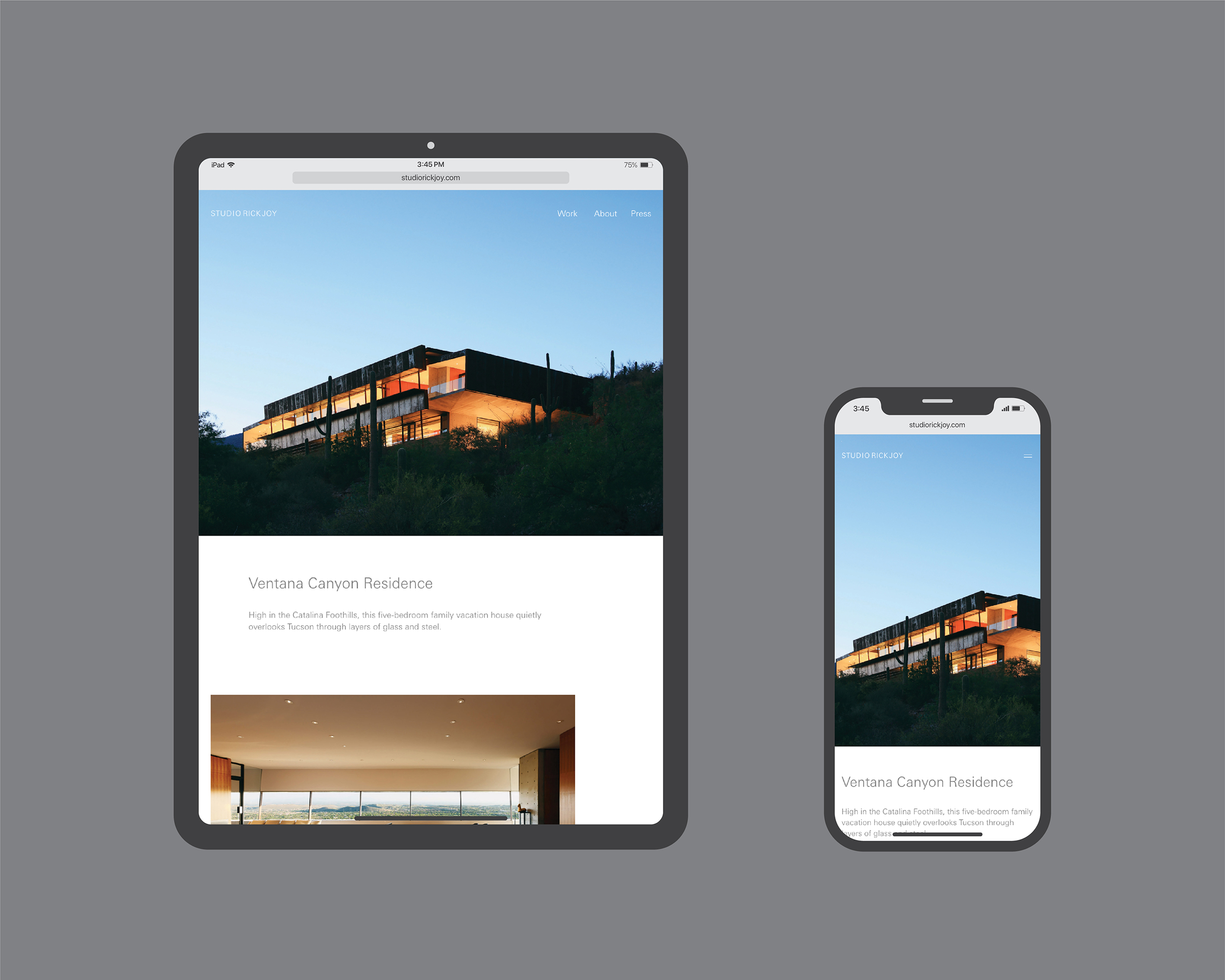
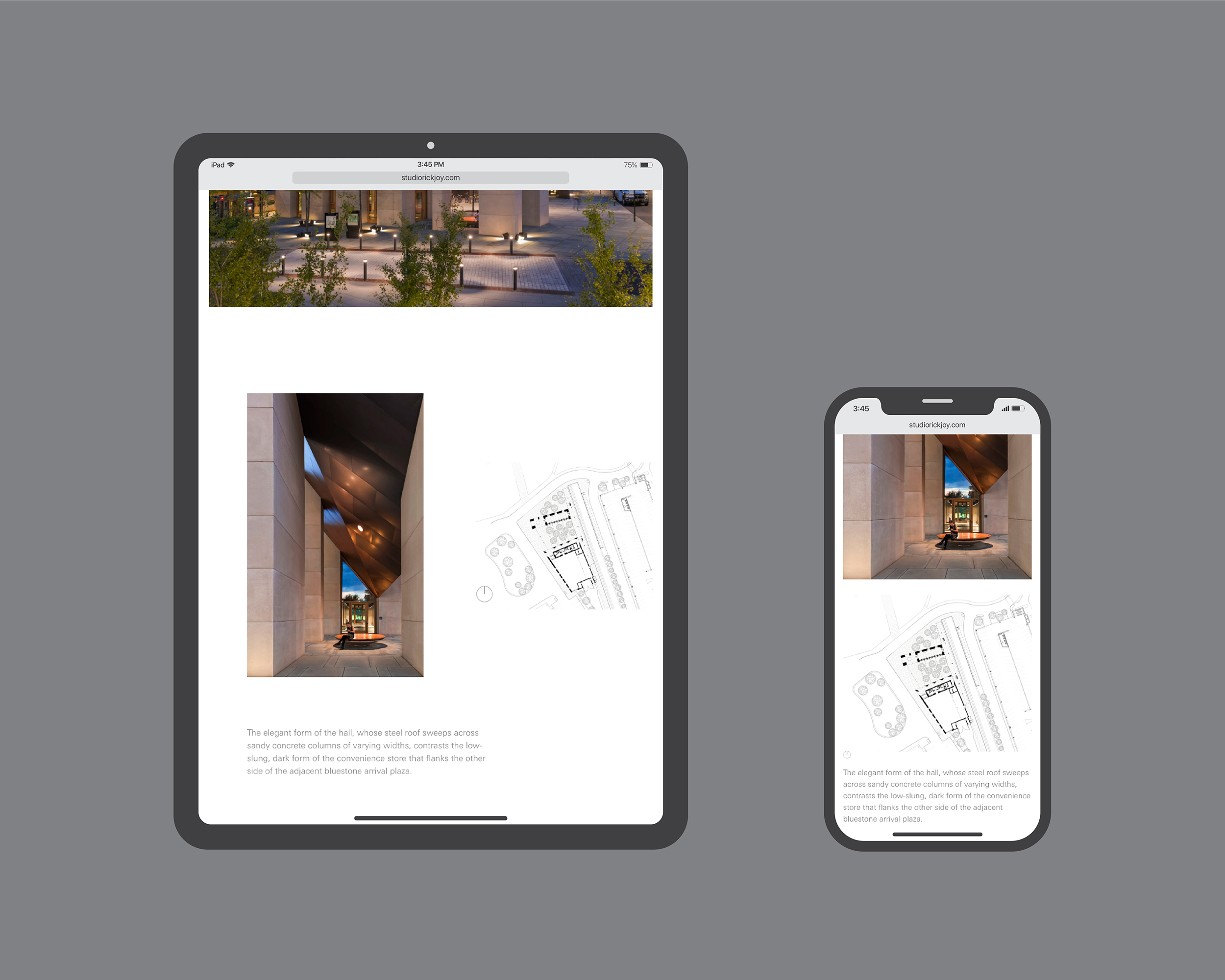
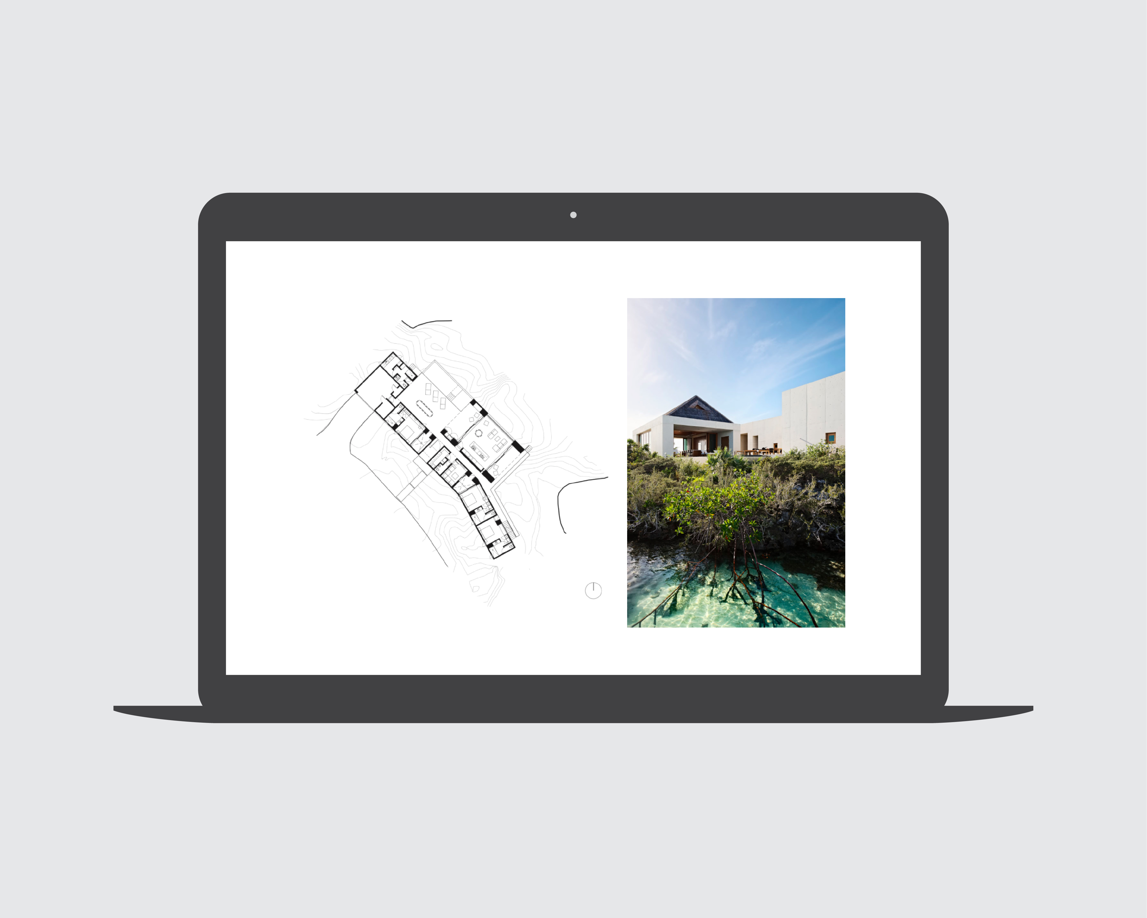
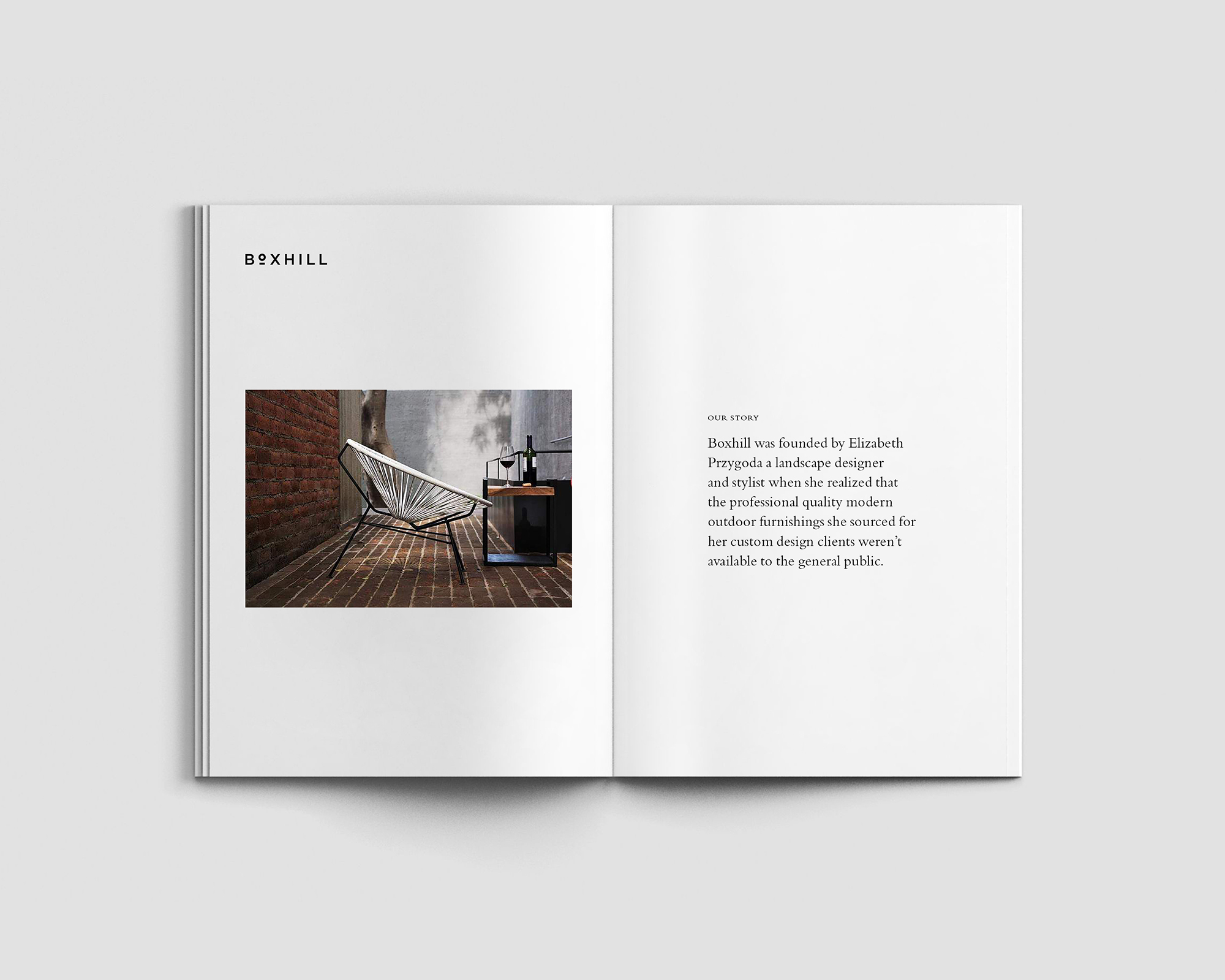
Studio Rick Joy
> website


Problem
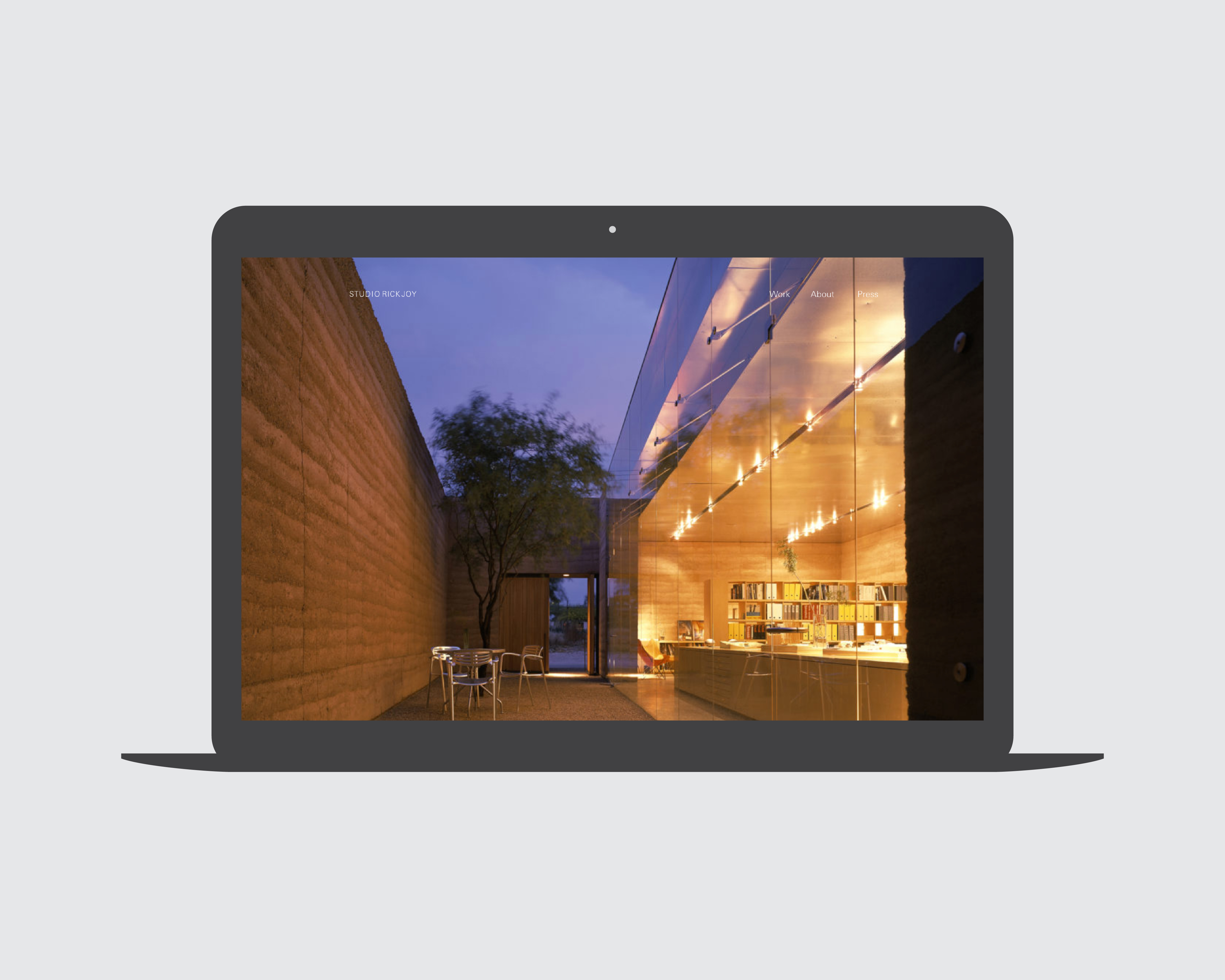
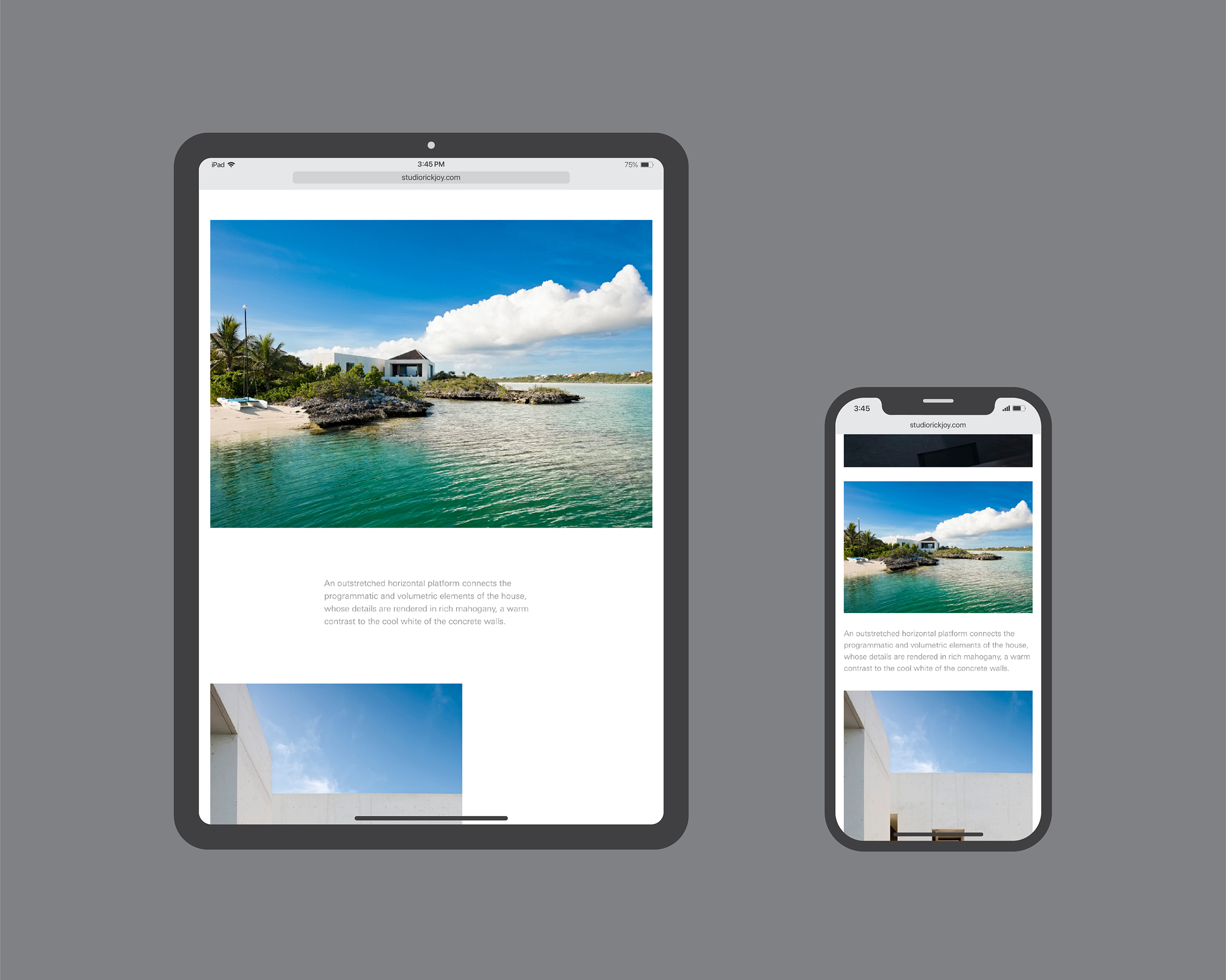
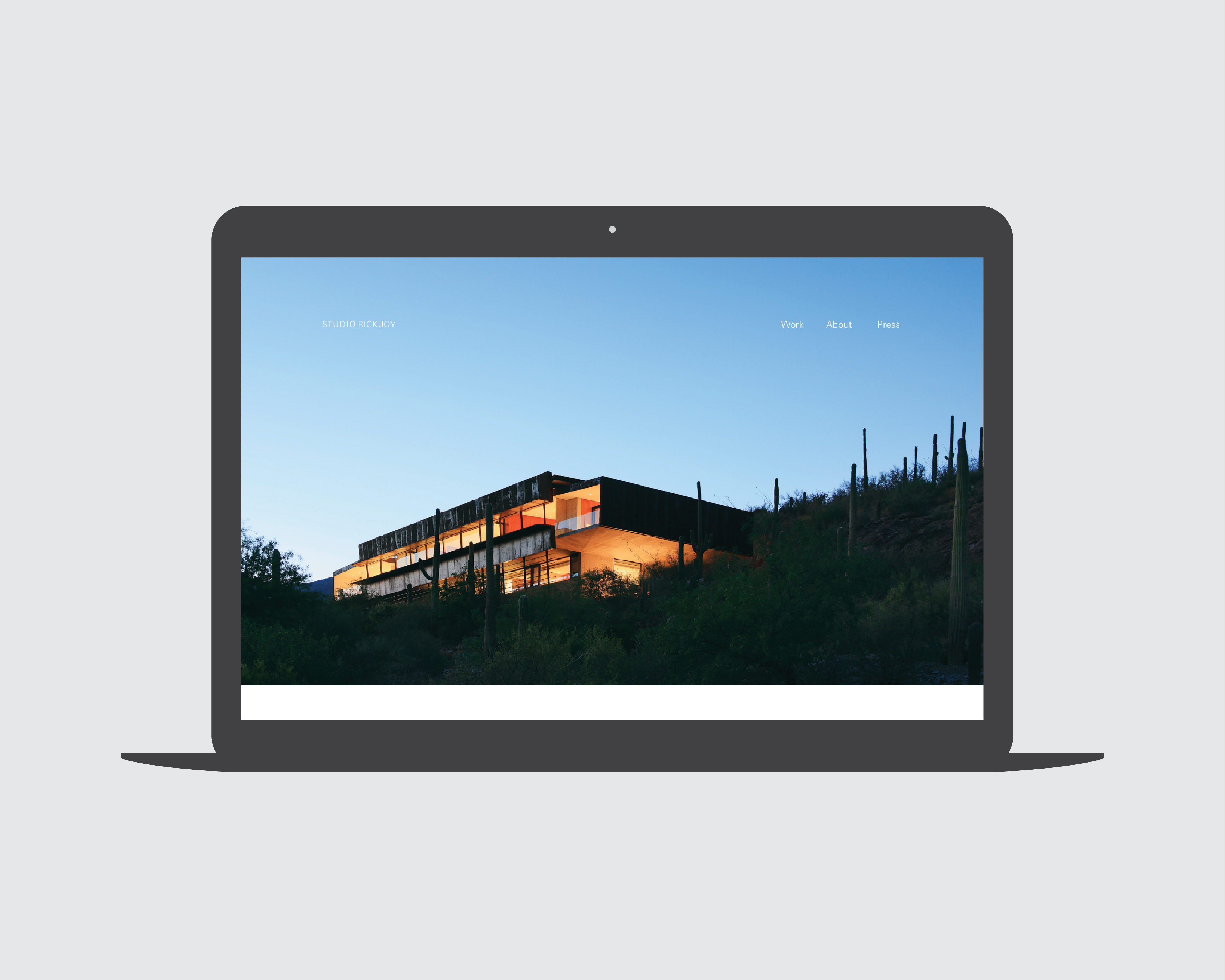
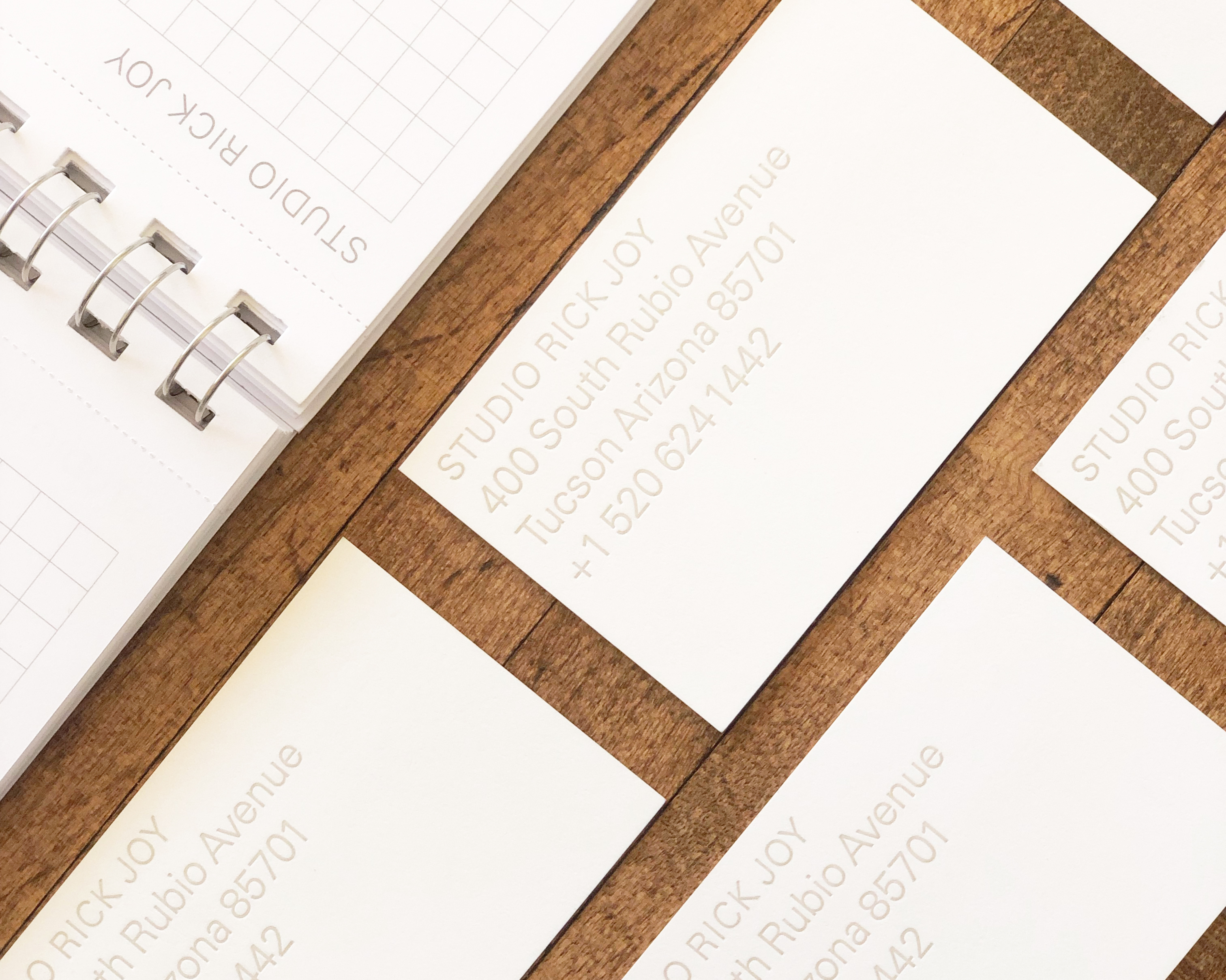
The principal of this global architecture firm based in Tucson wanted a website and business stationery. The studio had made do with a placeholder until it became apparent potential clients expected a website as a precursor to engaging the firm. New stationery had been deferred until the brand could be designed. For this group of architects, the challenge was to put into words and images the feeling, meaning, and ethereal qualities of the residential and commercial work the firm designs.
The principal of this global architecture firm based in Tucson wanted a website and business stationery. The studio had made do with a placeholder until it became apparent potential clients expected a website as a precursor to engaging the firm. New stationery had been deferred until the brand could be designed. For this group of architects, the challenge was to put into words and images the feeling, meaning, and ethereal qualities of the residential and commercial work the firm designs.
Outcome
For a visual identity and website to be effective requires a strategy that articulates who the firm is, what’s on offer, and how the team is uniquely positioned to deliver. We began by articulating the firm’s strategy. We conducted lengthy, open-ended interviews with every member of the firm to understand how the architecture practice evolved, where it aspired to go, and the meaning of its core values. We clarified the firm’s mission, philosophy, and brand hierarchy and prepared a strategy brief that summed up the main messages to be conveyed and goals to be achieved.
For a visual identity and website to be effective requires a strategy that articulates who the firm is, what’s on offer, and how the team is uniquely positioned to deliver. We began by articulating the firm’s strategy. We conducted lengthy, open-ended interviews with every member of the firm to understand how the architecture practice evolved, where it aspired to go, and the meaning of its core values. We clarified the firm’s mission, philosophy, and brand hierarchy and prepared a strategy brief that summed up the main messages to be conveyed and goals to be achieved.
It was due to the interwoven dialogues in our iterative process, working with the studio’s leaders, asking questions, and being “comprehensively observant” that the project succeeded. Using professional photography along with new poetic copy, we designed and launched a website that compellingly conveys built projects and is flexible to embrace future work, and implemented a suite of letterpress printed stationery and colatteral.
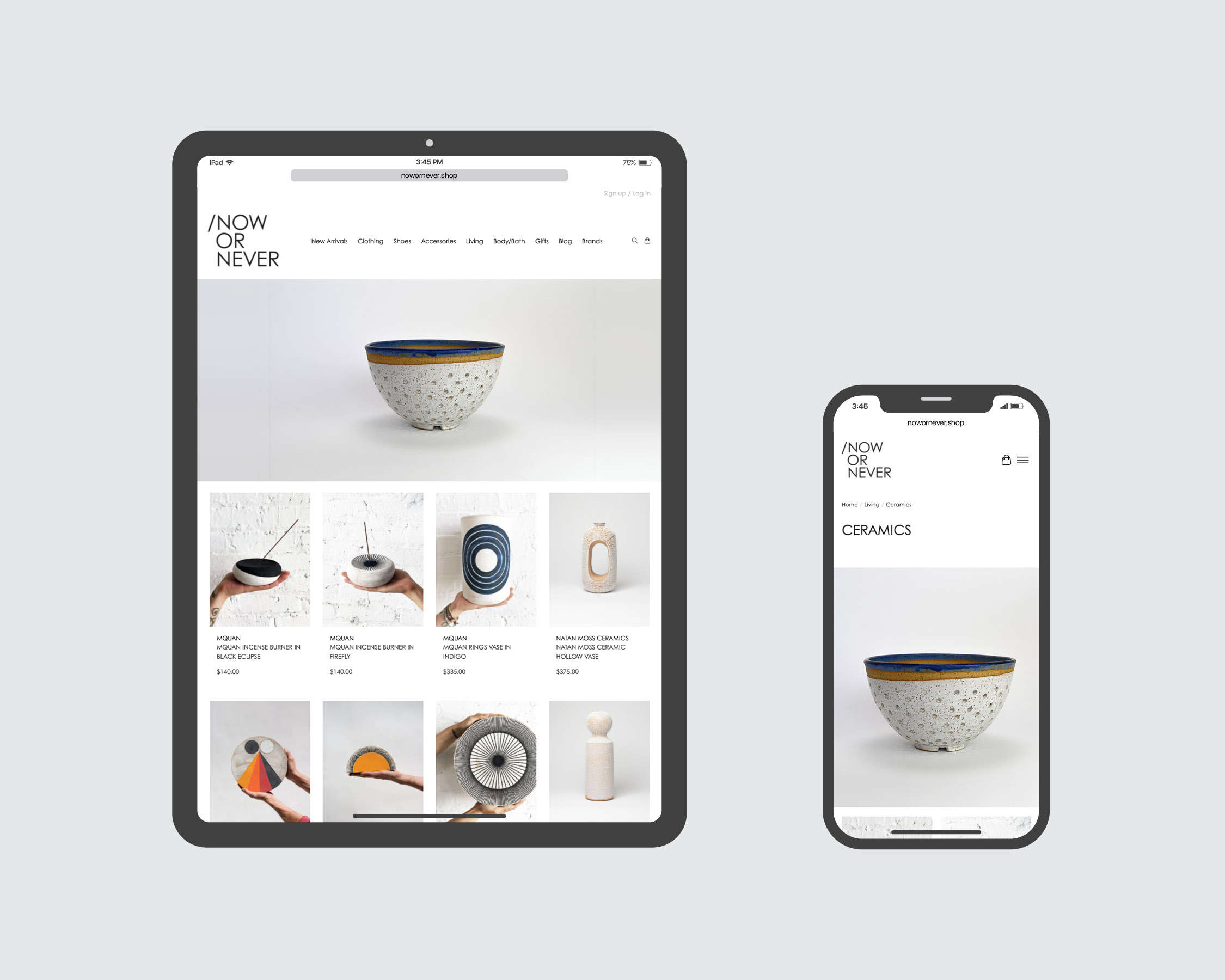
Now or Never
> website


Problem
This young retail store was moving from Tucson to Phoenix to a new location that was both larger and more prominent in the cityscape. They came to us looking for a refresh of their graphic identity that could then be publicized via social media, in-store and on window displays, and with retail packaging as a way to build momentum for their opening.
This young retail store was moving from Tucson to Phoenix to a new location that was both larger and more prominent in the cityscape. They came to us looking for a refresh of their graphic identity that could then be publicized via social media, in-store and on window displays, and with retail packaging as a way to build momentum for their opening.
Outcome
One of the hardest challenges in design is to improve an existing identity that isn’t so inadequate as to justify starting over, but which is underperforming and in need of an injection of energy. The redesigned logo was both subtle and game-changing, reinvigorating the visual identity without losing followers and customers who had grown familiar with the look. Once we understood the problem to be solved, we made prototypes and validated these concepts with the partners before moving to implementation.
One of the hardest challenges in design is to improve an existing identity that isn’t so inadequate as to justify starting over, but which is underperforming and in need of an injection of energy. The redesigned logo was both subtle and game-changing, reinvigorating the visual identity without losing followers and customers who had grown familiar with the look. Once we understood the problem to be solved, we made prototypes and validated these concepts with the partners before moving to implementation.
We created a distinctive visual identity that expressed the premium fashion brands offered inside the store. We made clever use of materials and production methods to produce a luxury experience on a tight budget.
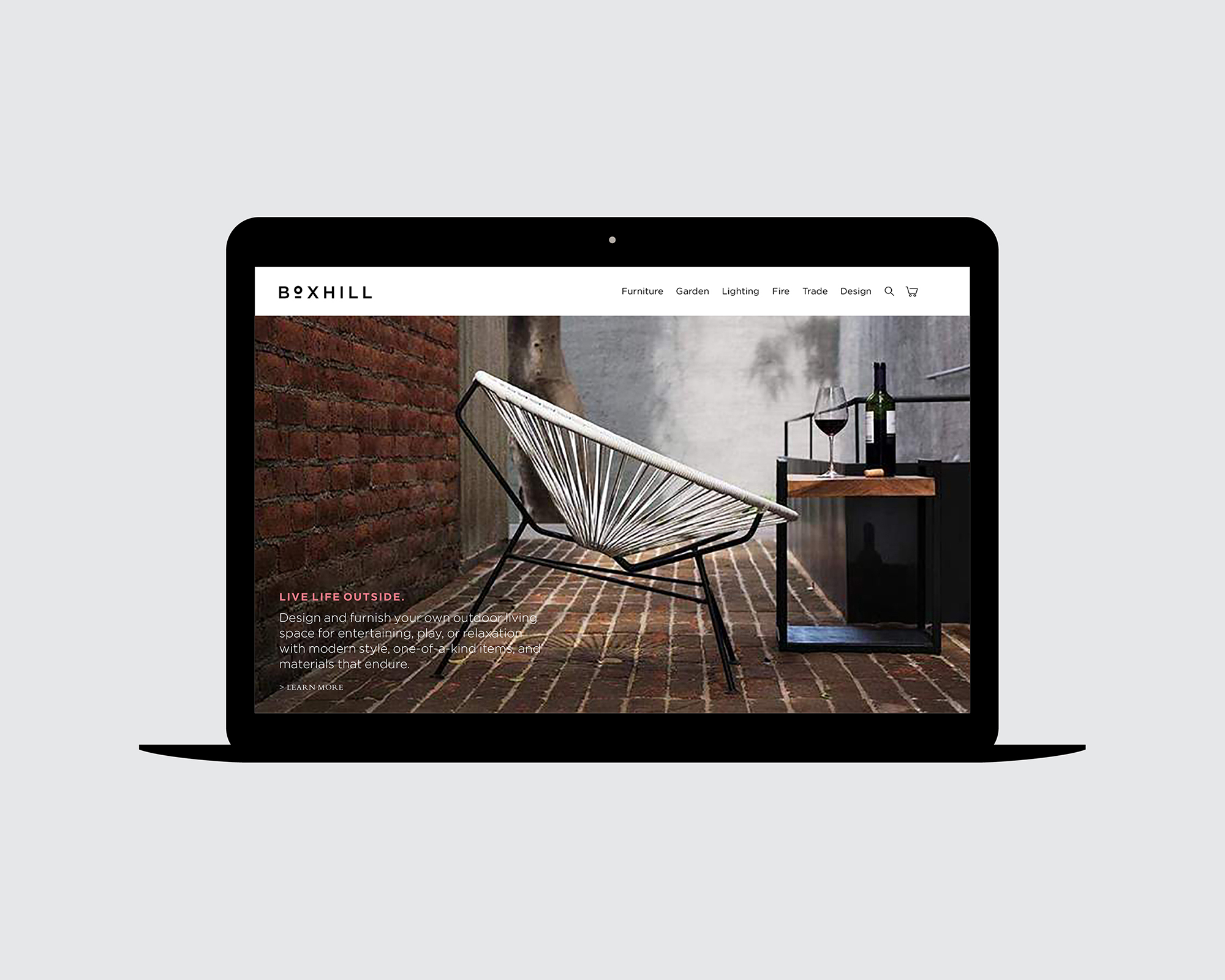
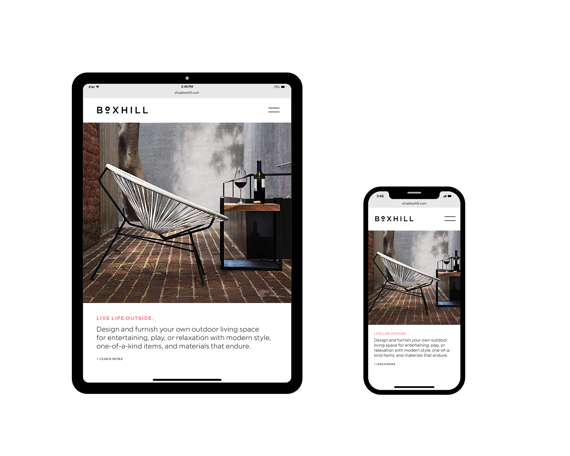
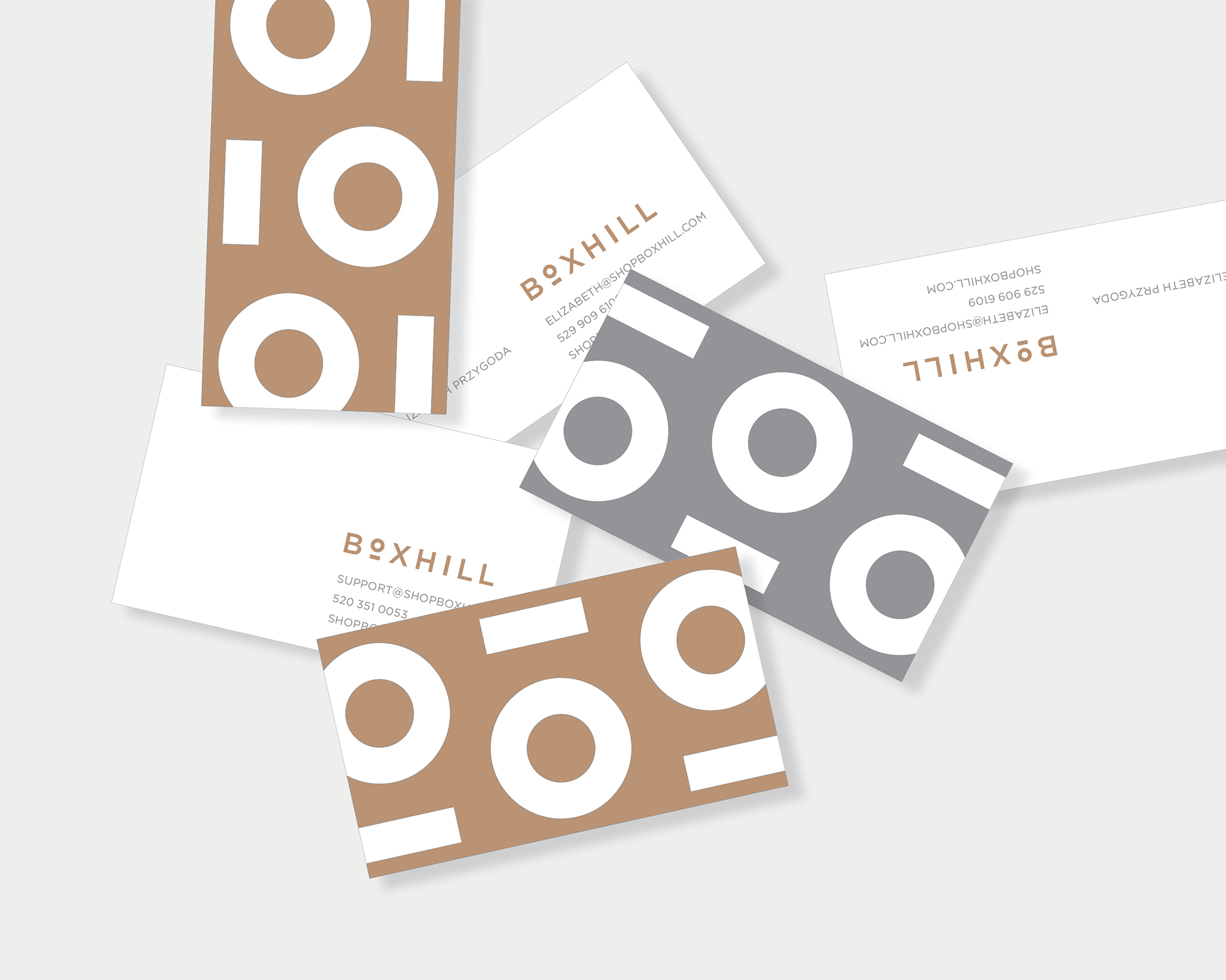
Boxhill
> website


Problem
An entrepreneur succeeds and as she sprints to keep up with day-to-day operations, the basic elements of good branding fall by the wayside until one day she realizes the initial homegrown visual identity is holding the firm back from realizing its full potential. Boxhill came to us for a brand makeover. We recognized that the e-commerce powerhouse not only needed a fresh look for its identity and website, but needed to bring clarity to the underlying strategy.
An entrepreneur succeeds and as she sprints to keep up with day-to-day operations, the basic elements of good branding fall by the wayside until one day she realizes the initial homegrown visual identity is holding the firm back from realizing its full potential. Boxhill came to us for a brand makeover. We recognized that the e-commerce powerhouse not only needed a fresh look for its identity and website, but needed to bring clarity to the underlying strategy.
Outcome
We conducted basic customer research to identify key factors associated with the brand’s equity and the competitive landscape. A SWOT analysis focused the brand story and gave us a field of defining elements. Once we articulated the ideas behind the brand strategy, the logo, color palette, typography, and website design followed. We redesigned the existing website, rewrote all copy and content, and designed brand standards.
We conducted basic customer research to identify key factors associated with the brand’s equity and the competitive landscape. A SWOT analysis focused the brand story and gave us a field of defining elements. Once we articulated the ideas behind the brand strategy, the logo, color palette, typography, and website design followed. We redesigned the existing website, rewrote all copy and content, and designed brand standards.
The result was a flexible and simple visual identity that connects the brand’s historical origins to the modern design of the products sold. The new identity elevated the brand and website which brought fresh enthusiasm to employees and vendor partnerships.
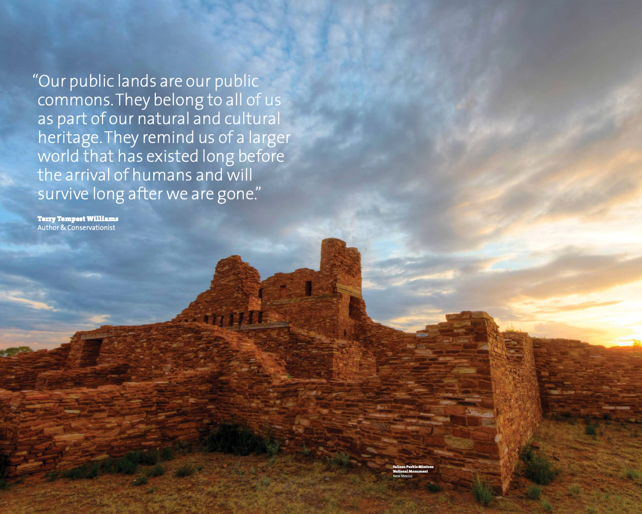
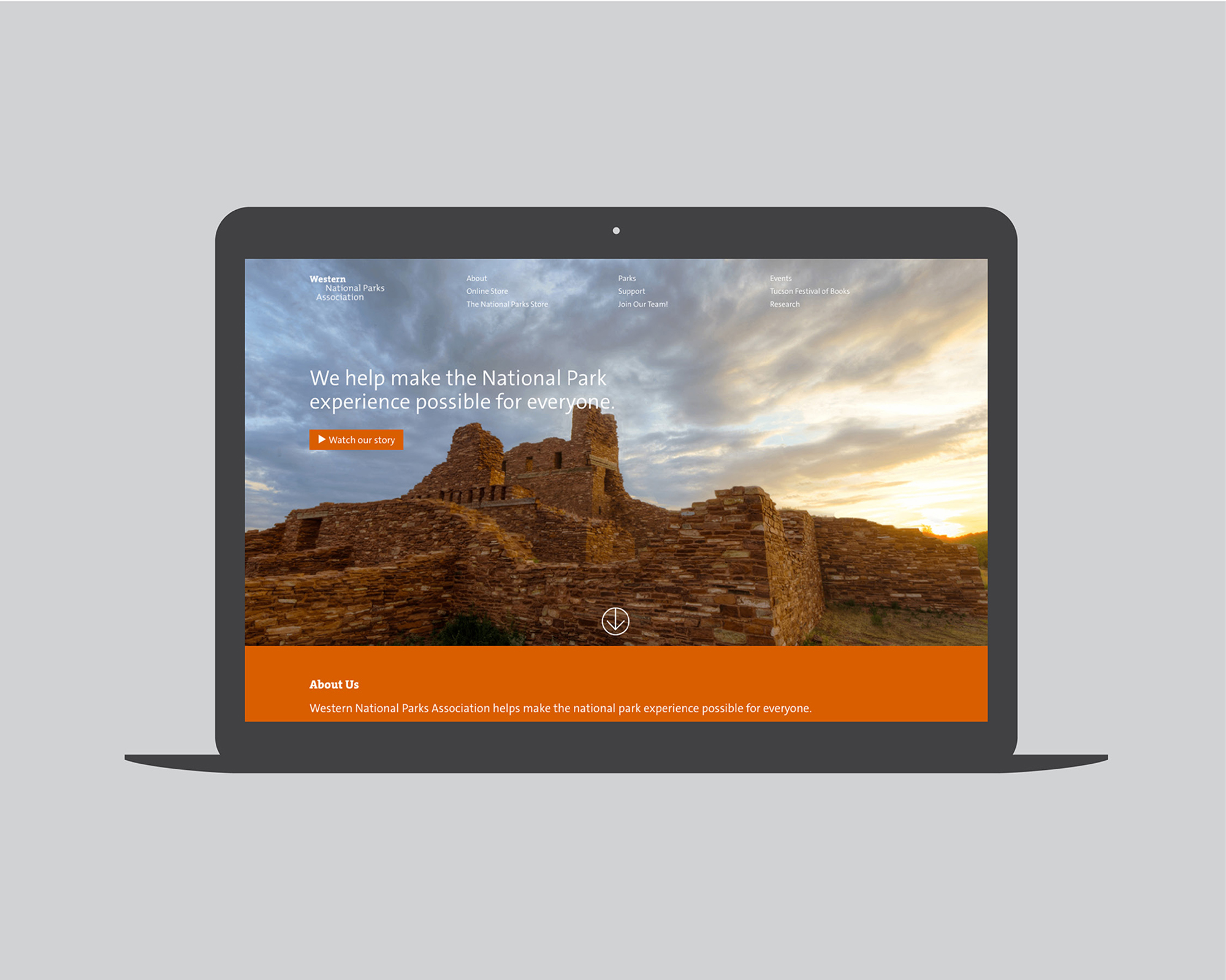
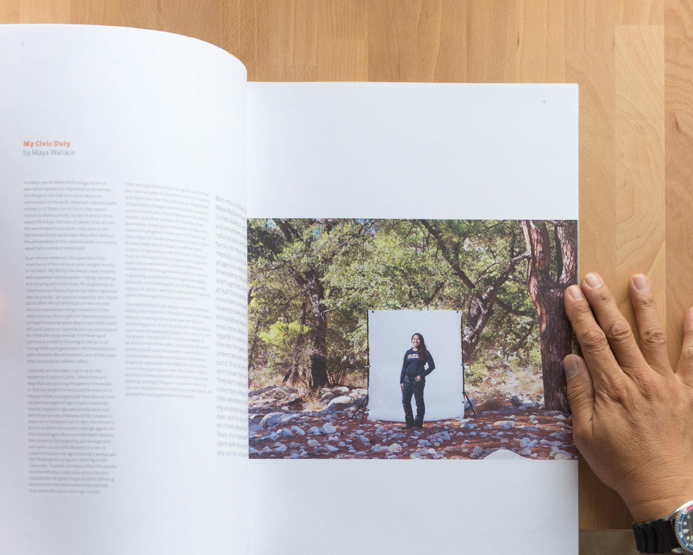
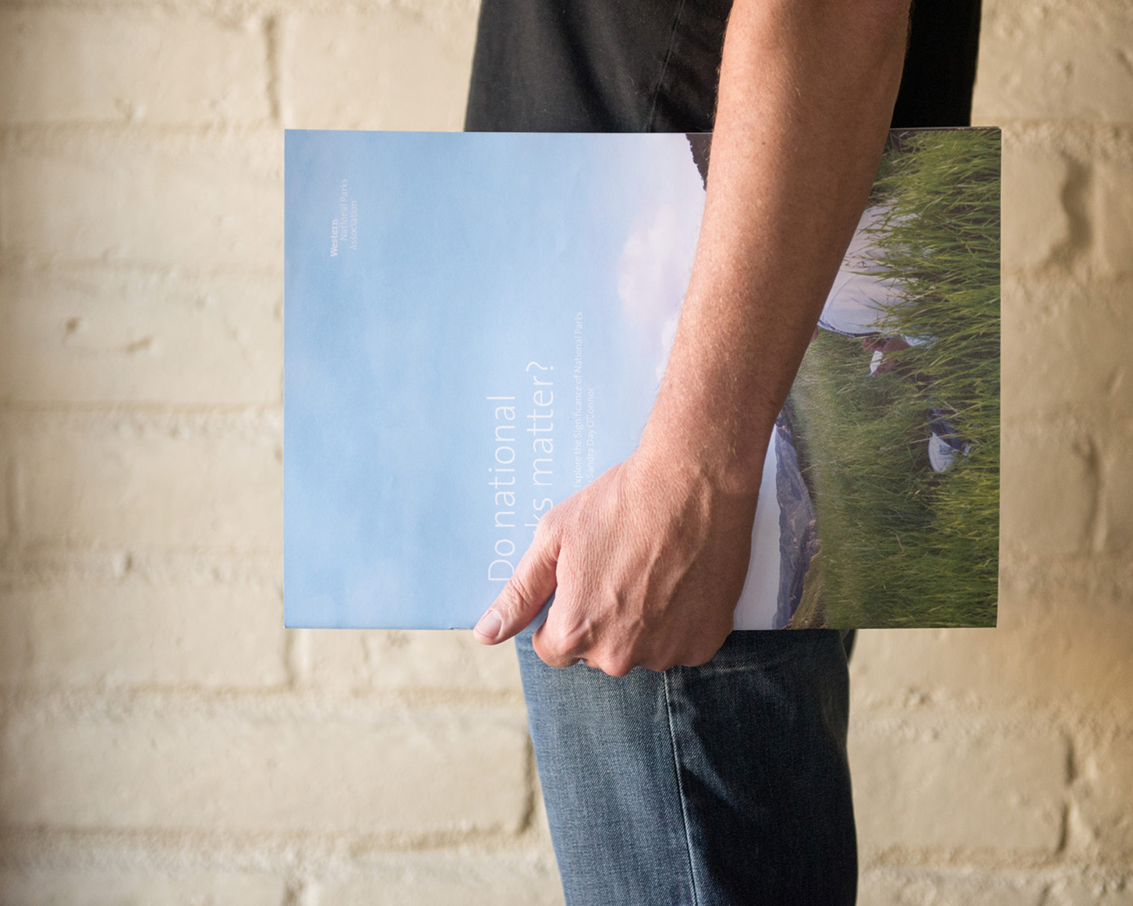
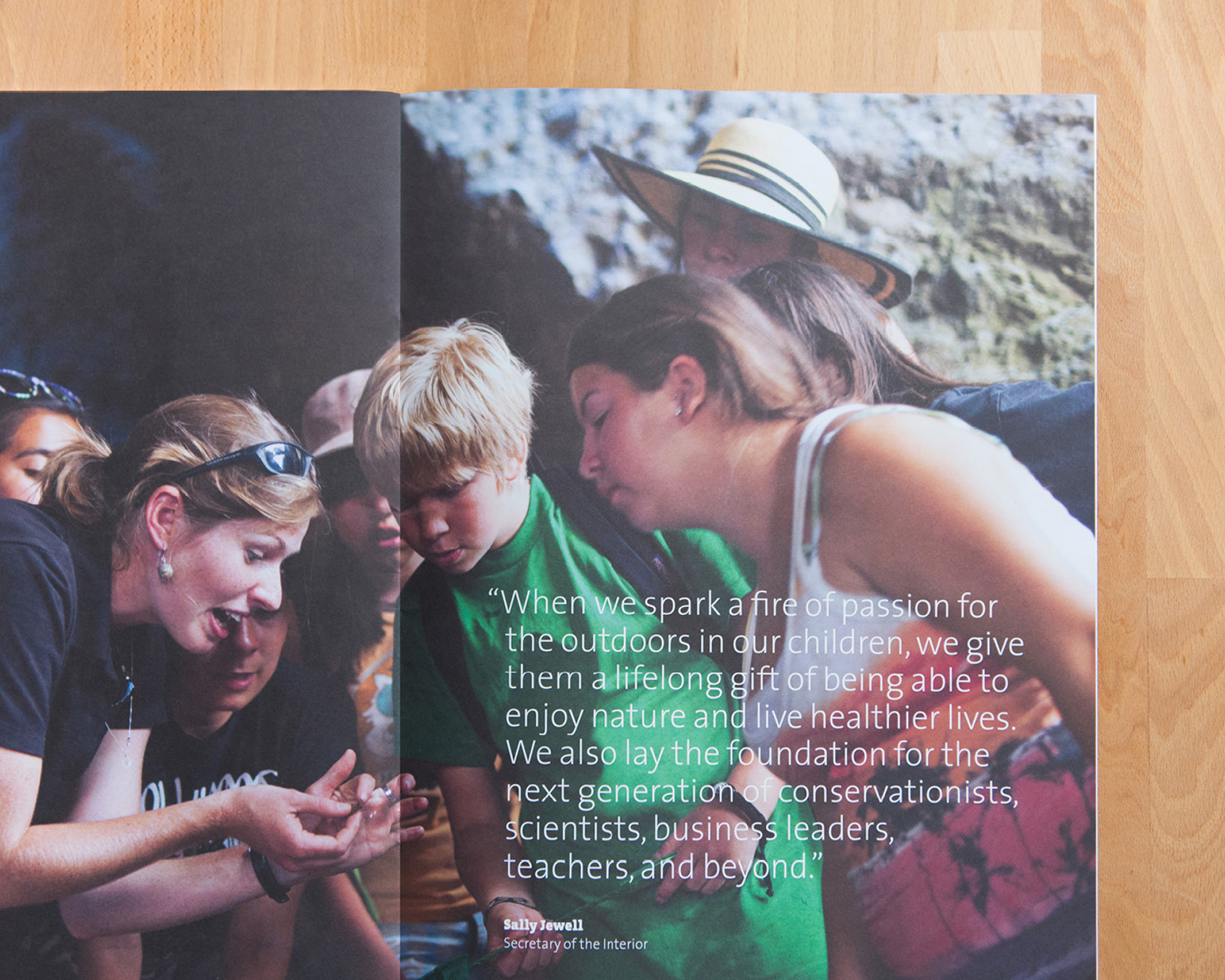
Western National Parks Association


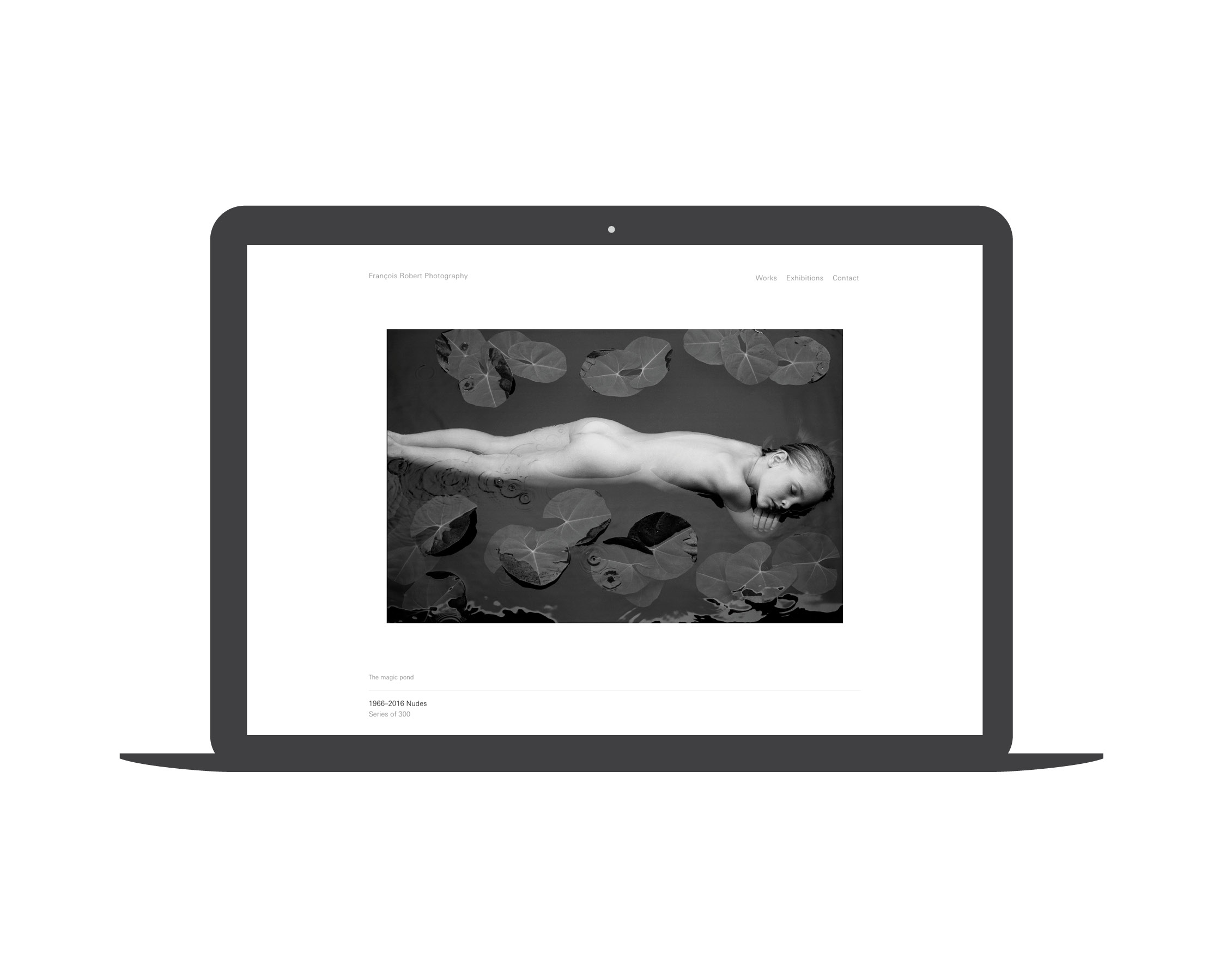
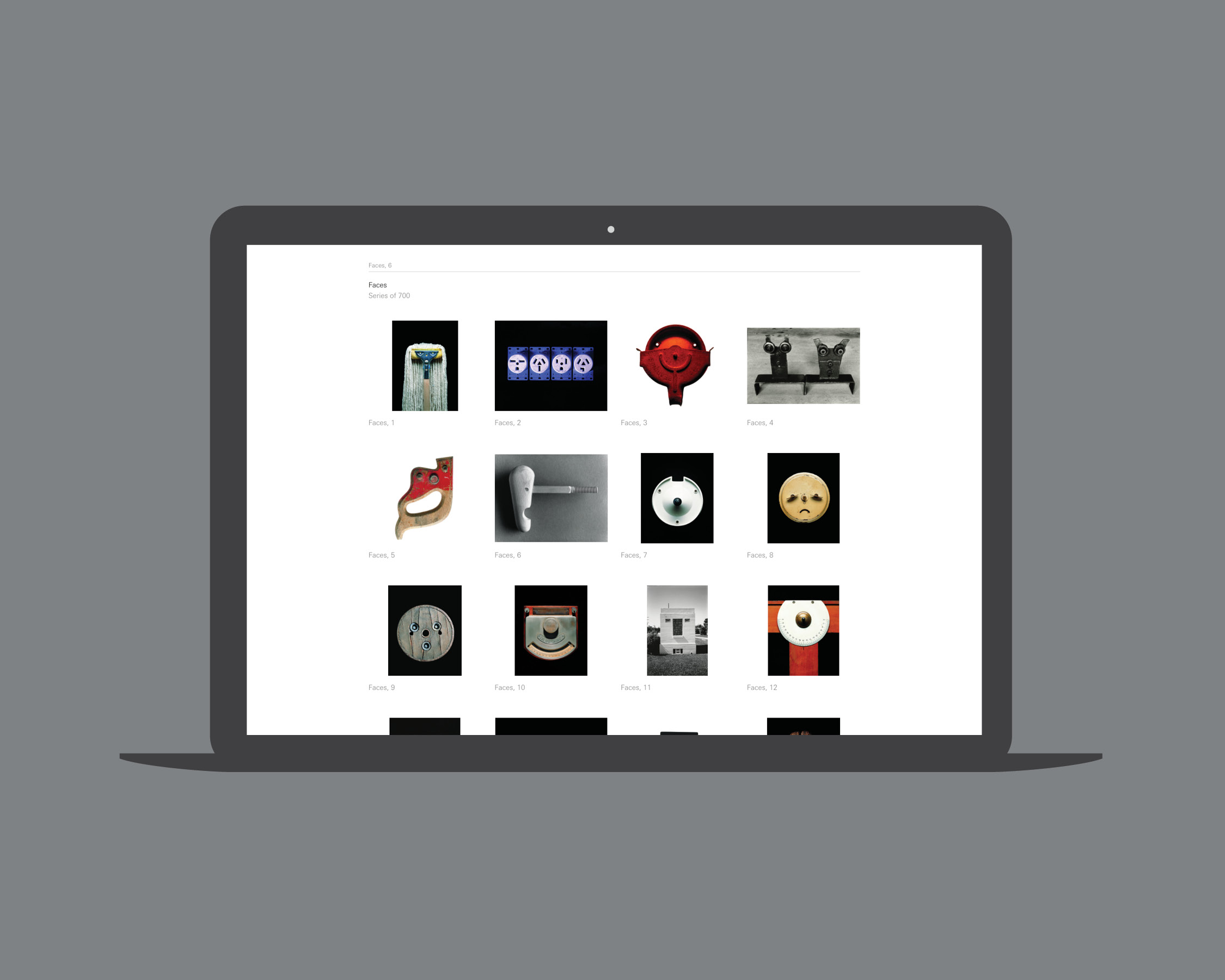
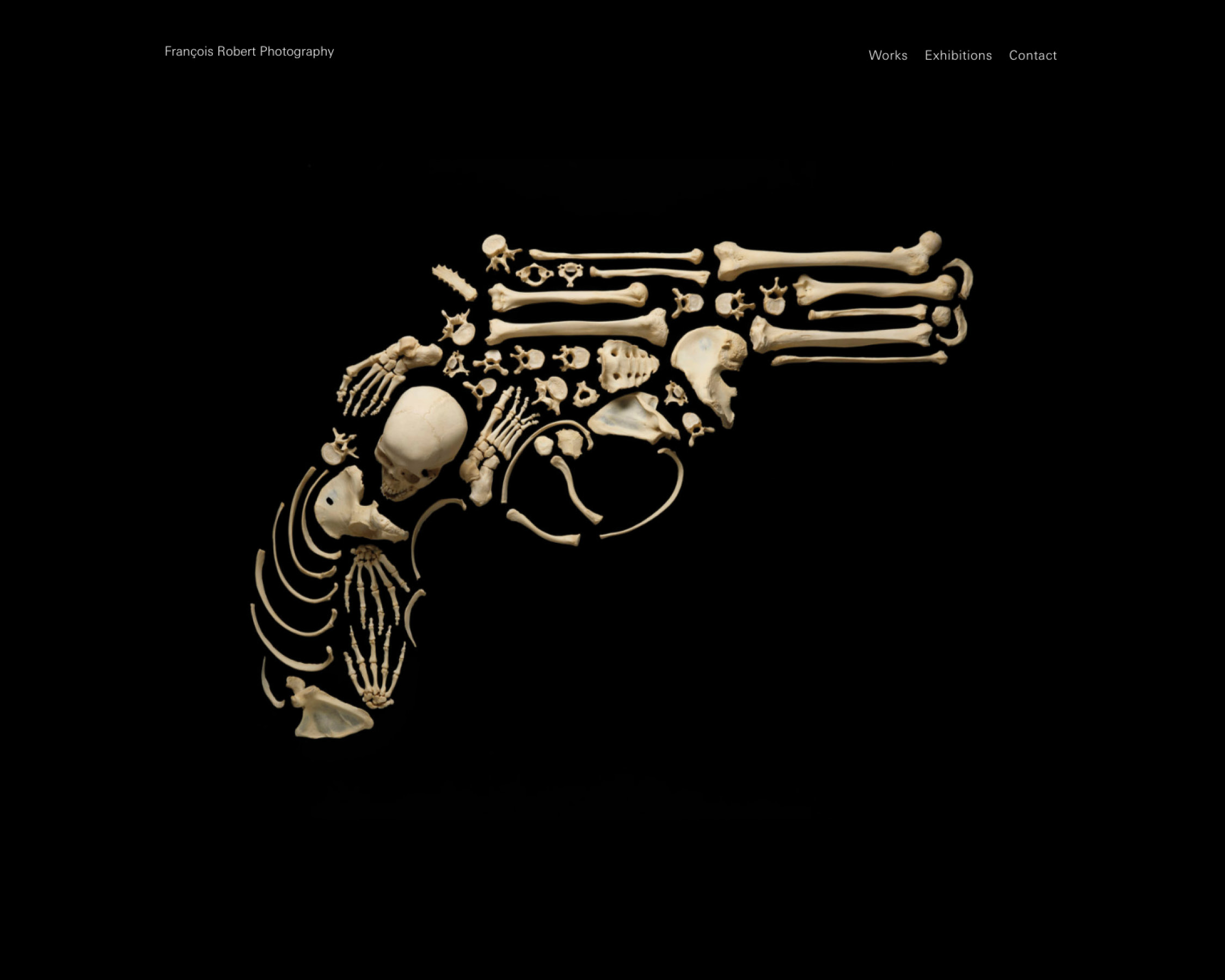
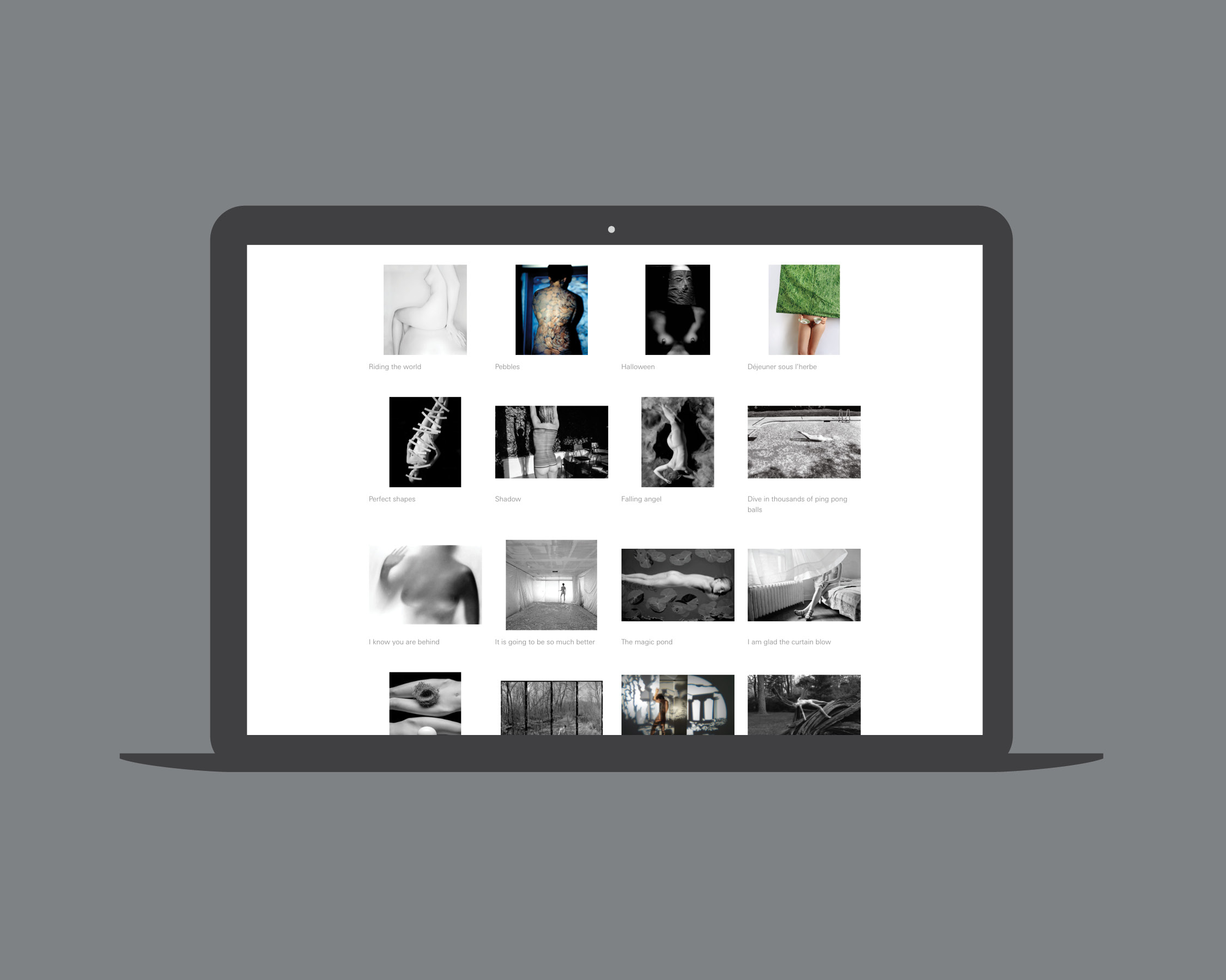
François Robert Photography
> website


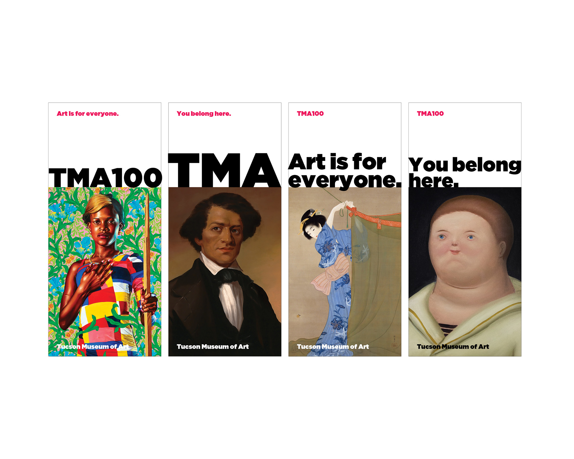
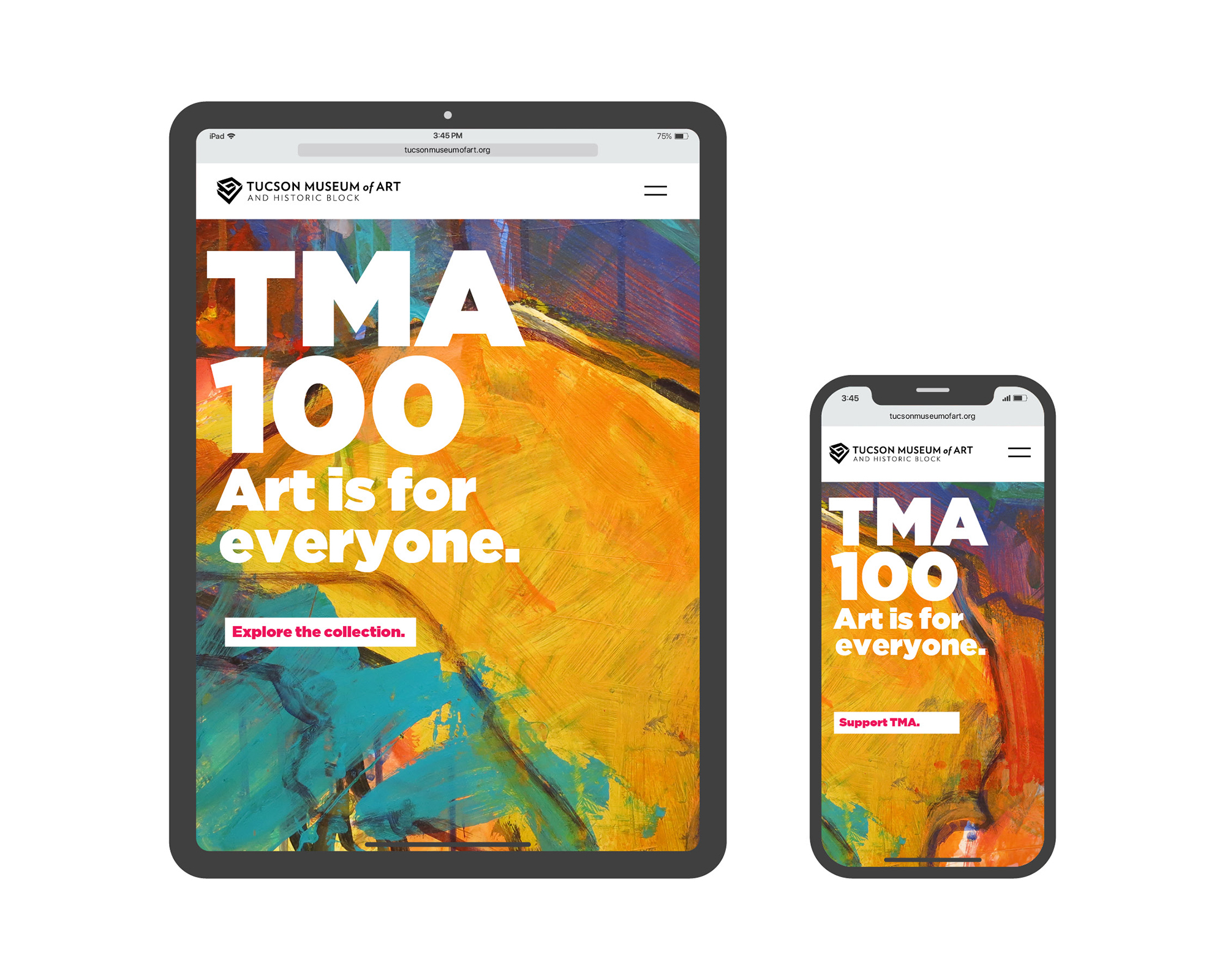
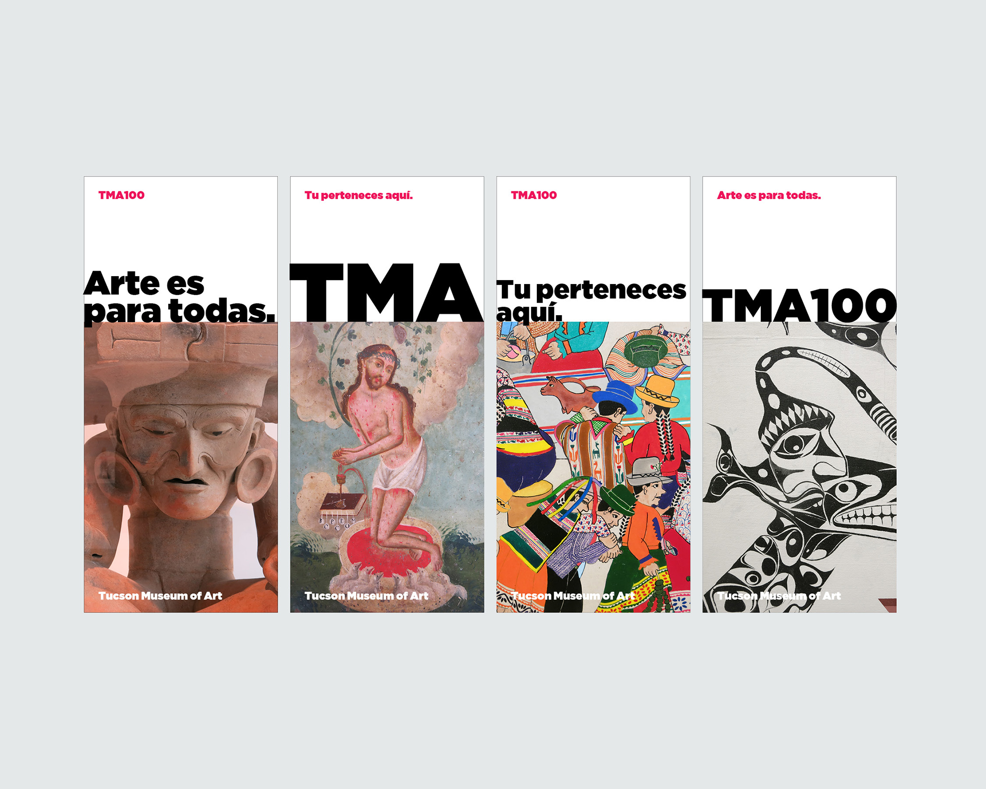
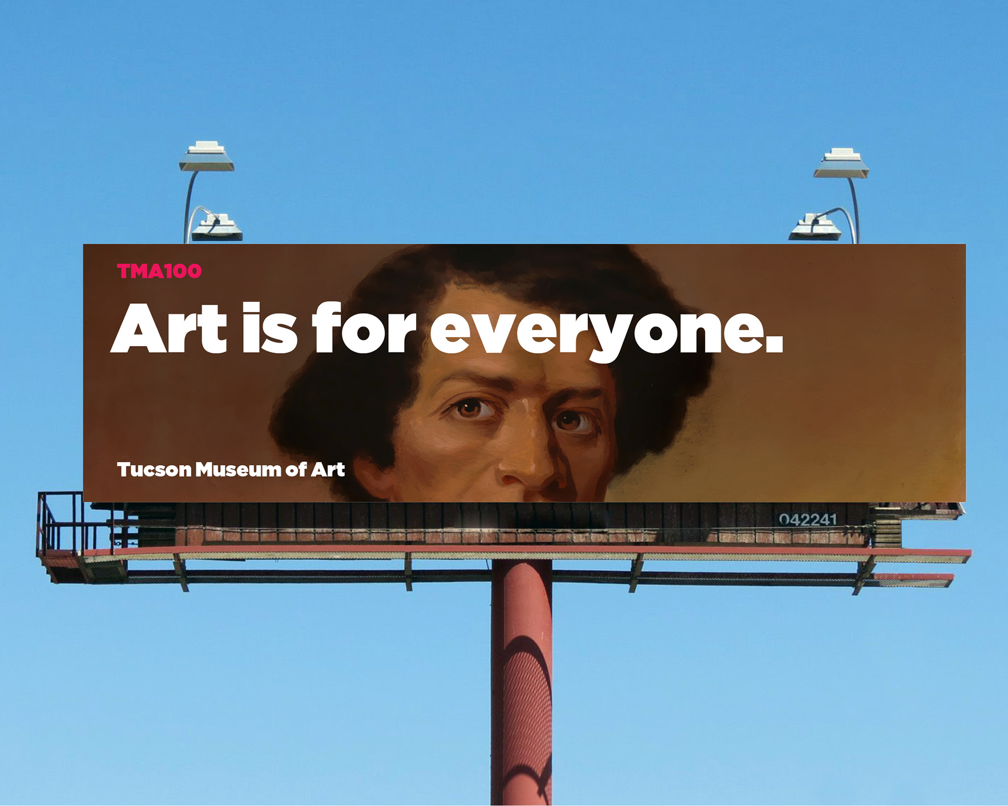
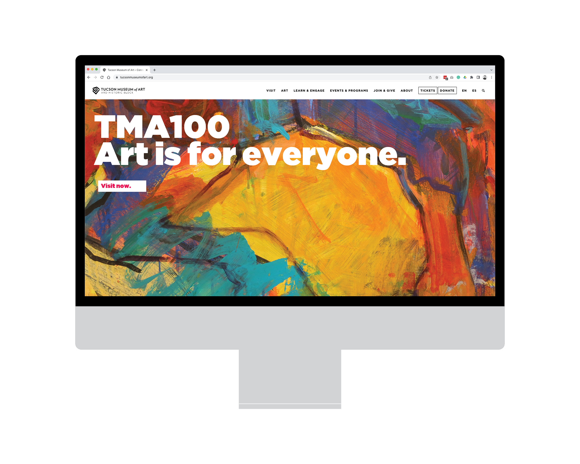
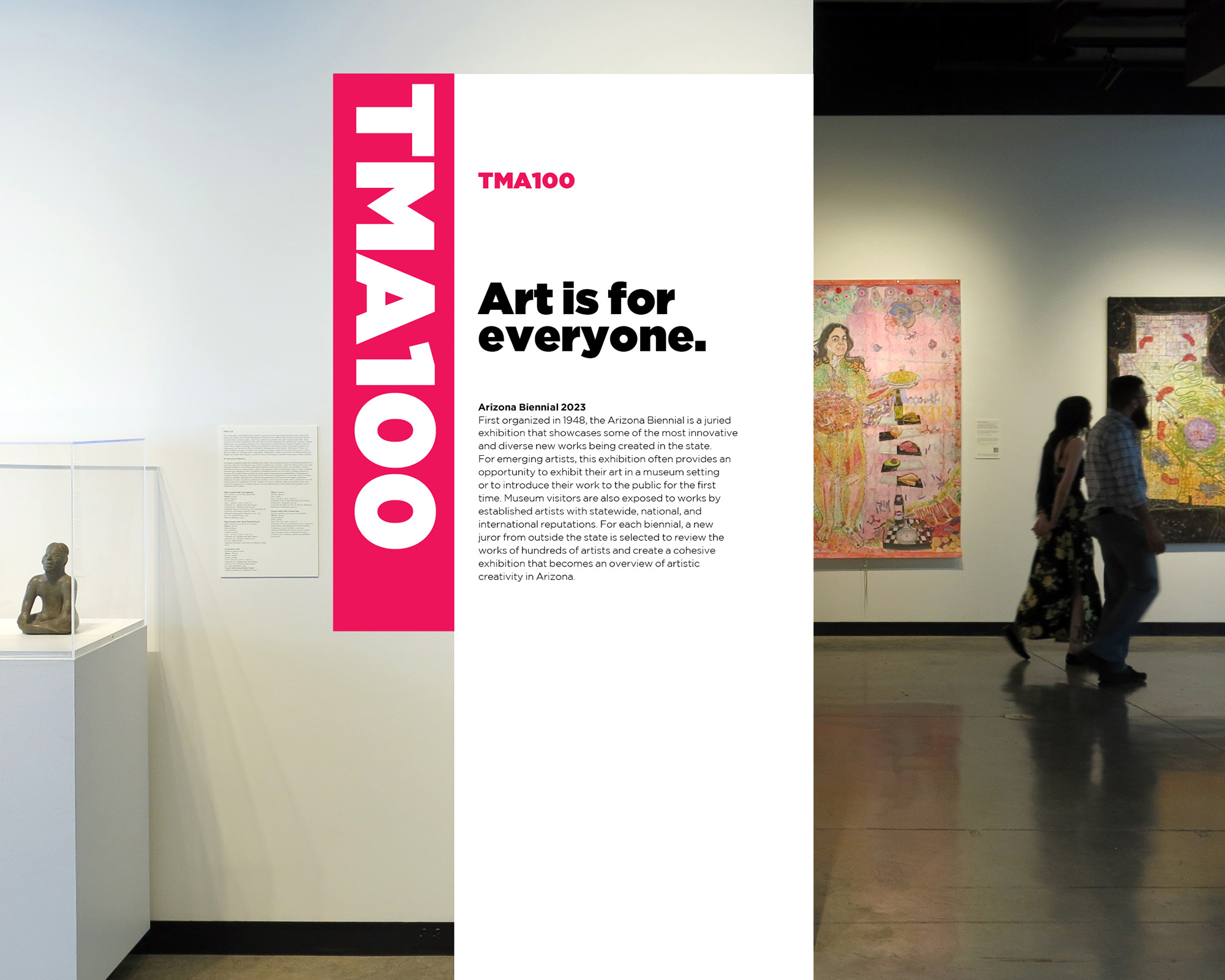
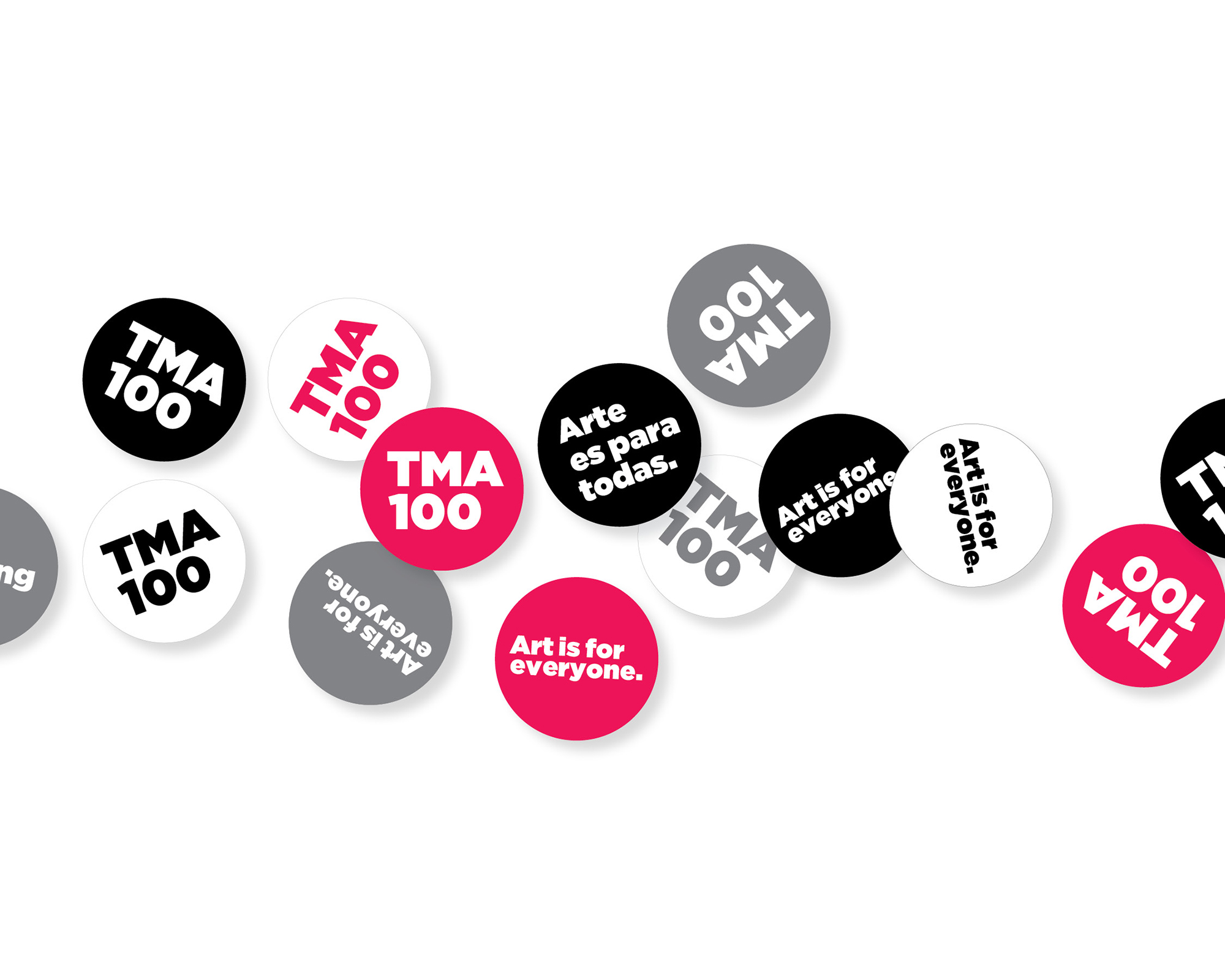
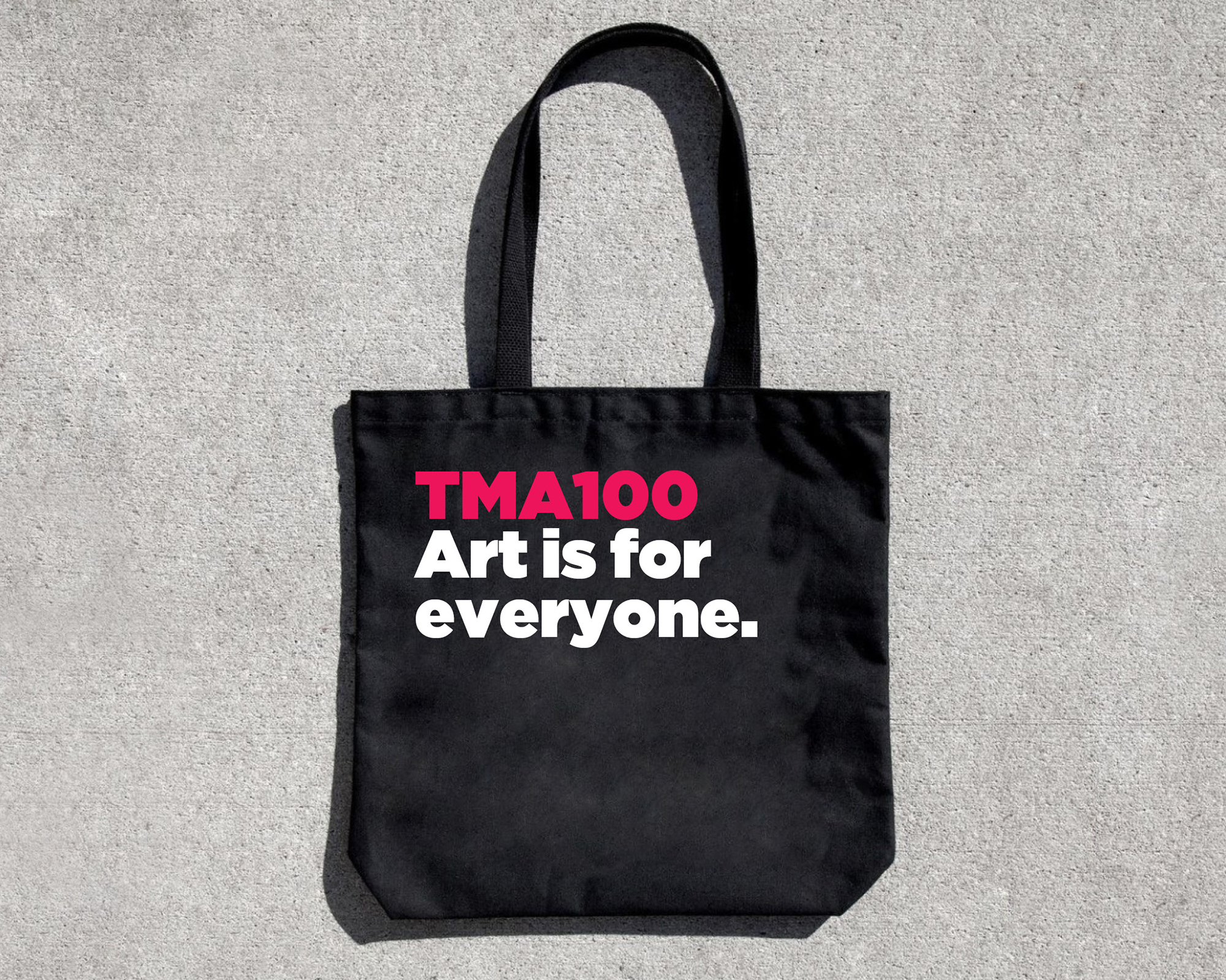
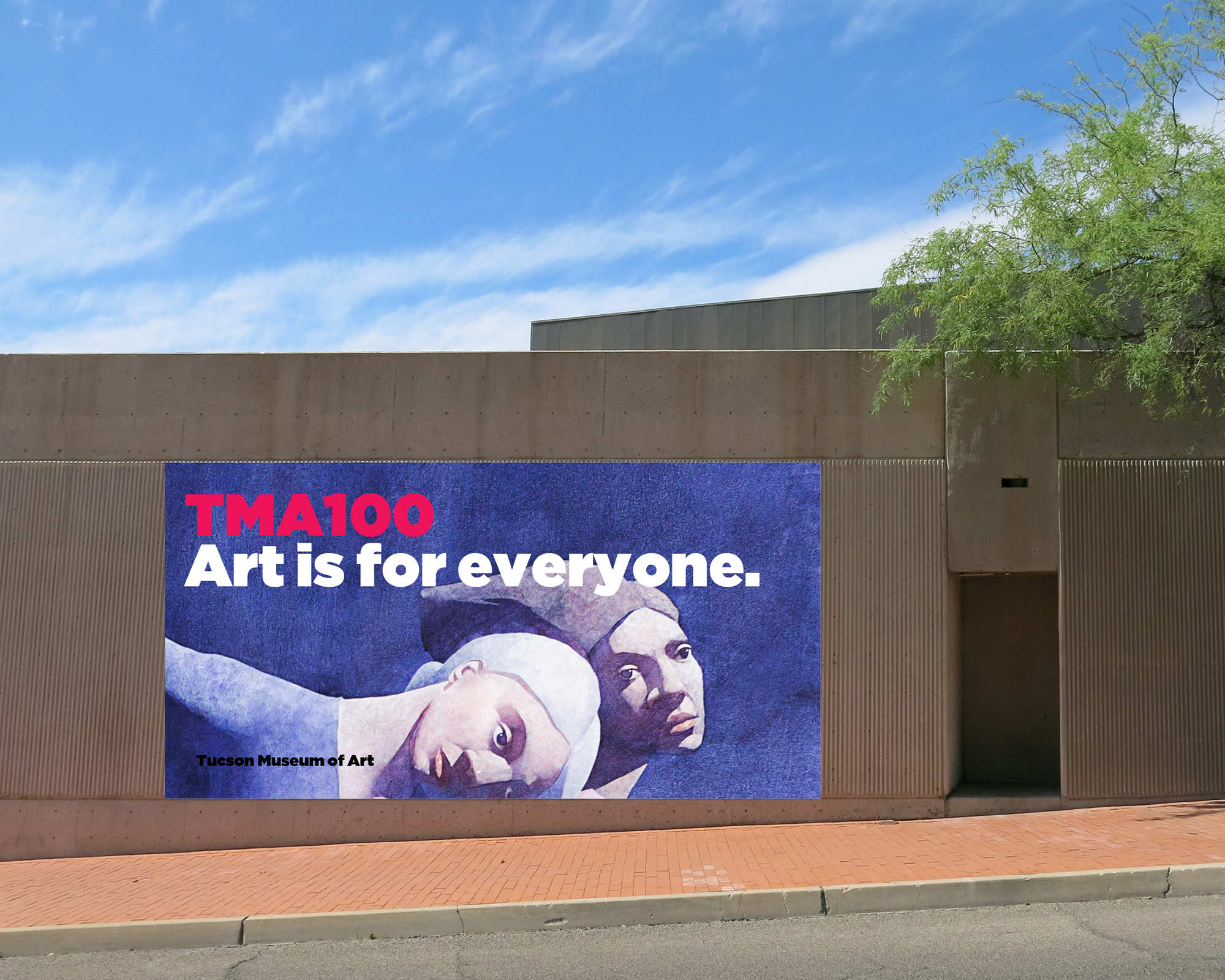
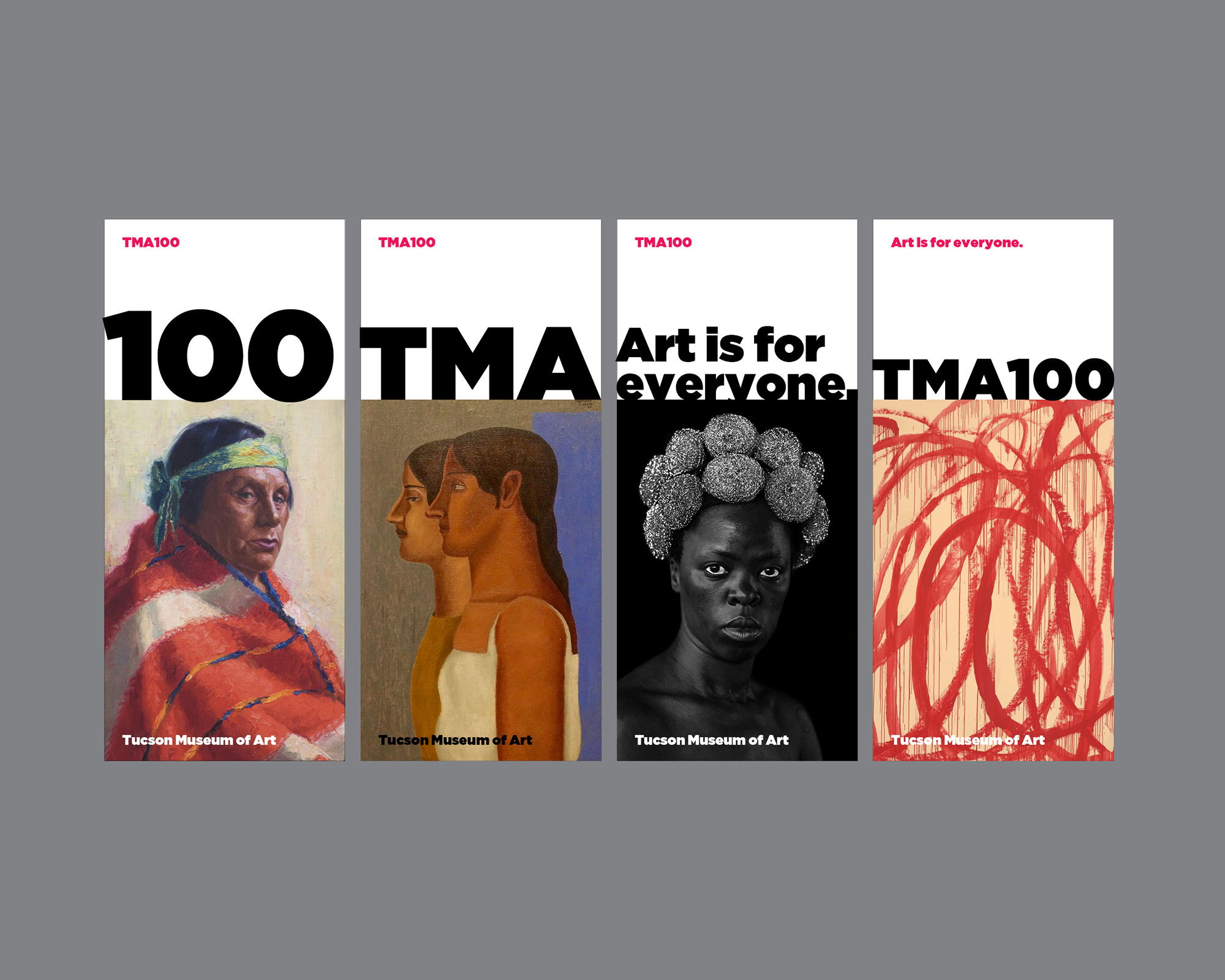
Tucson Museum of Art

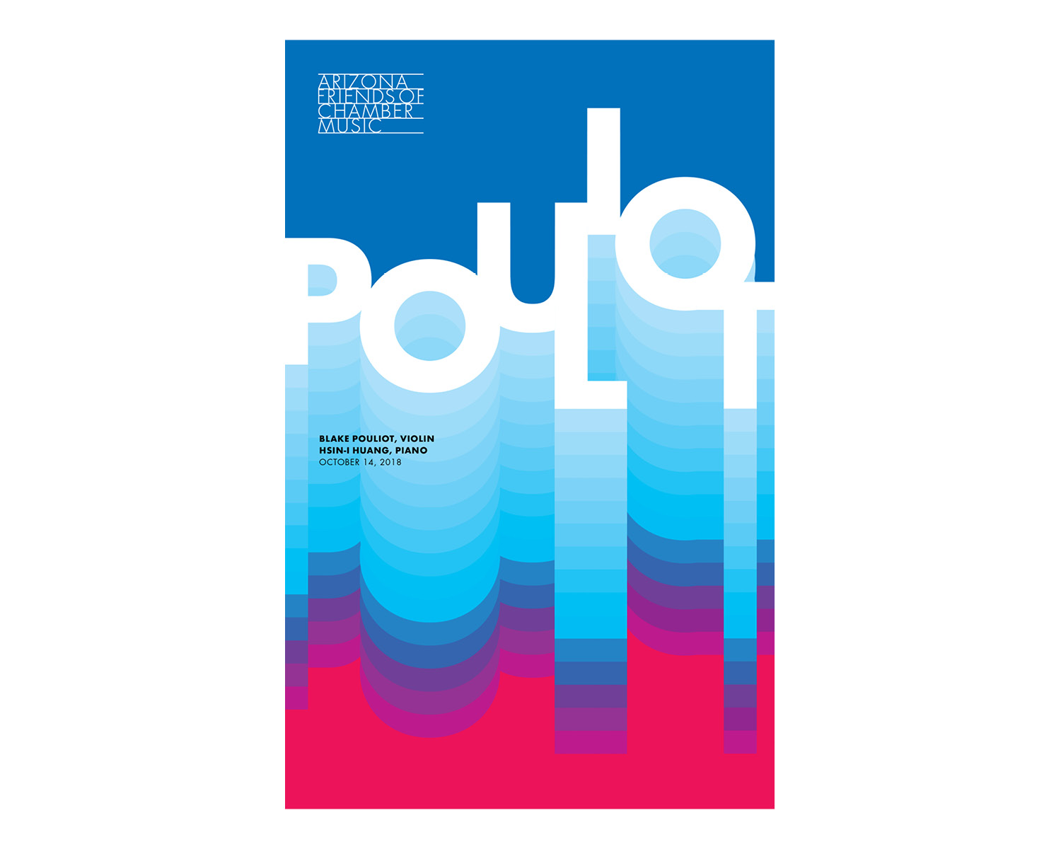
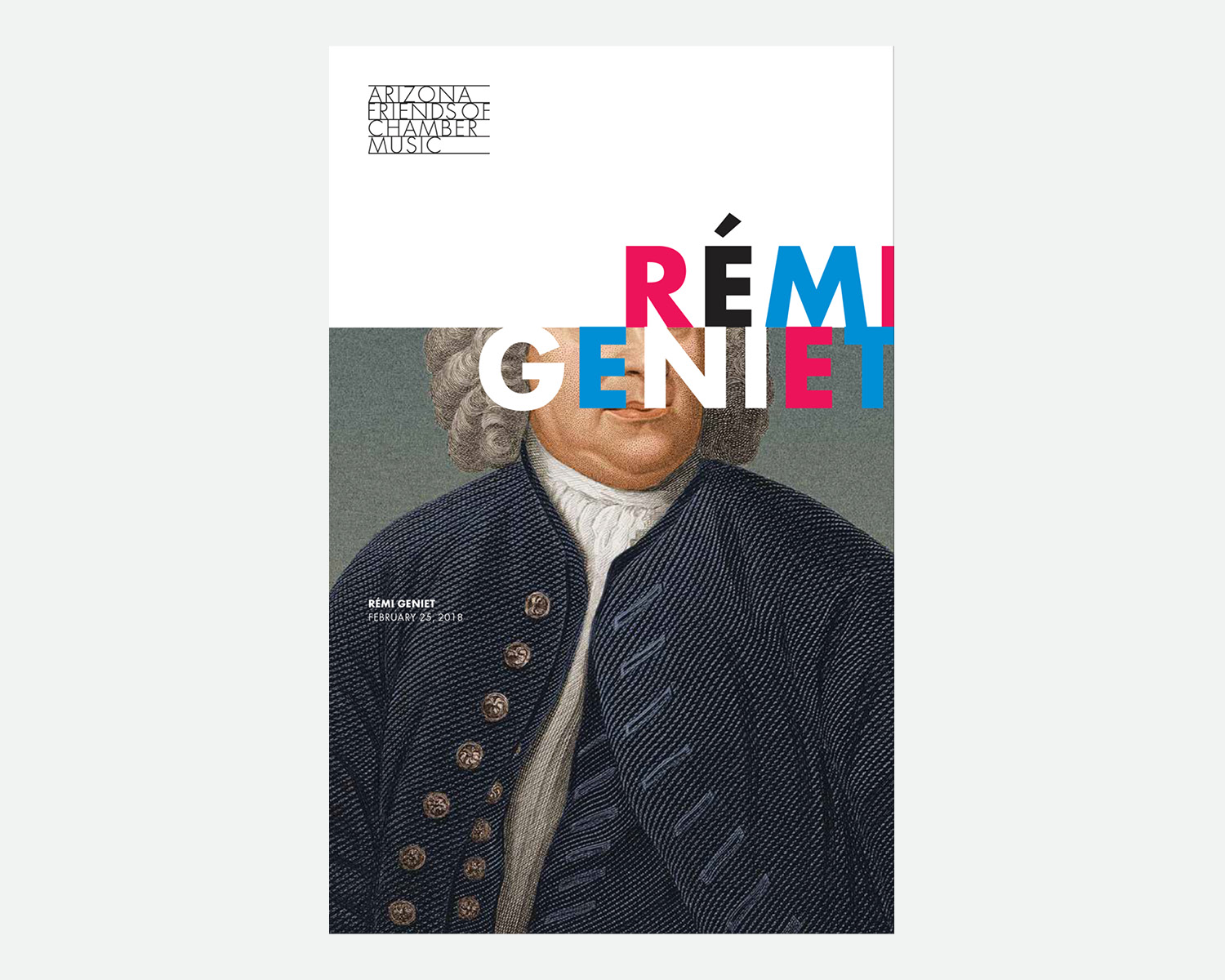
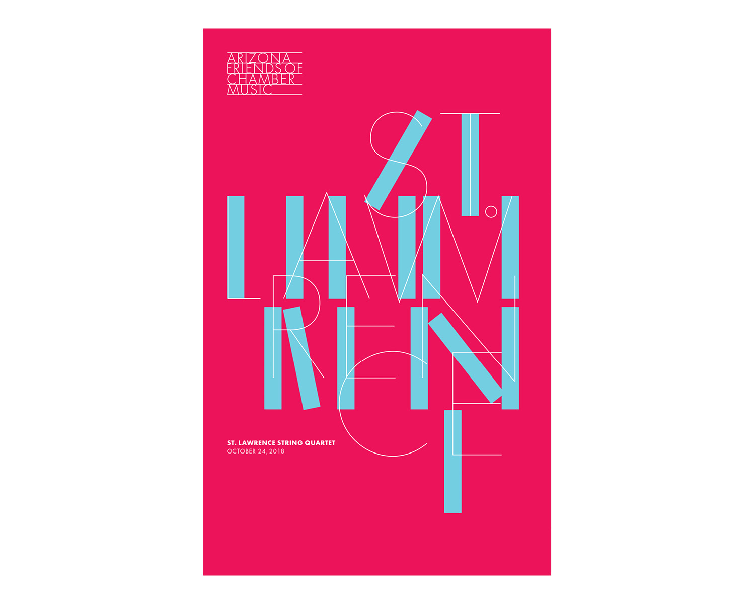
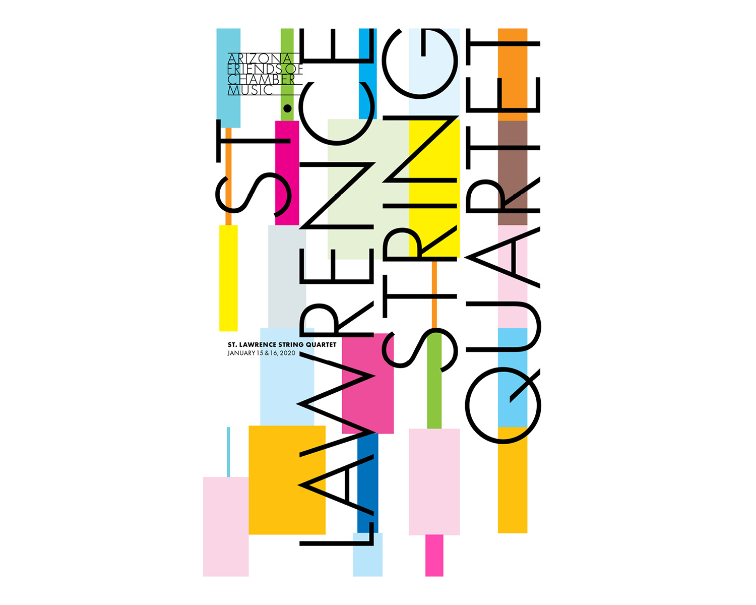
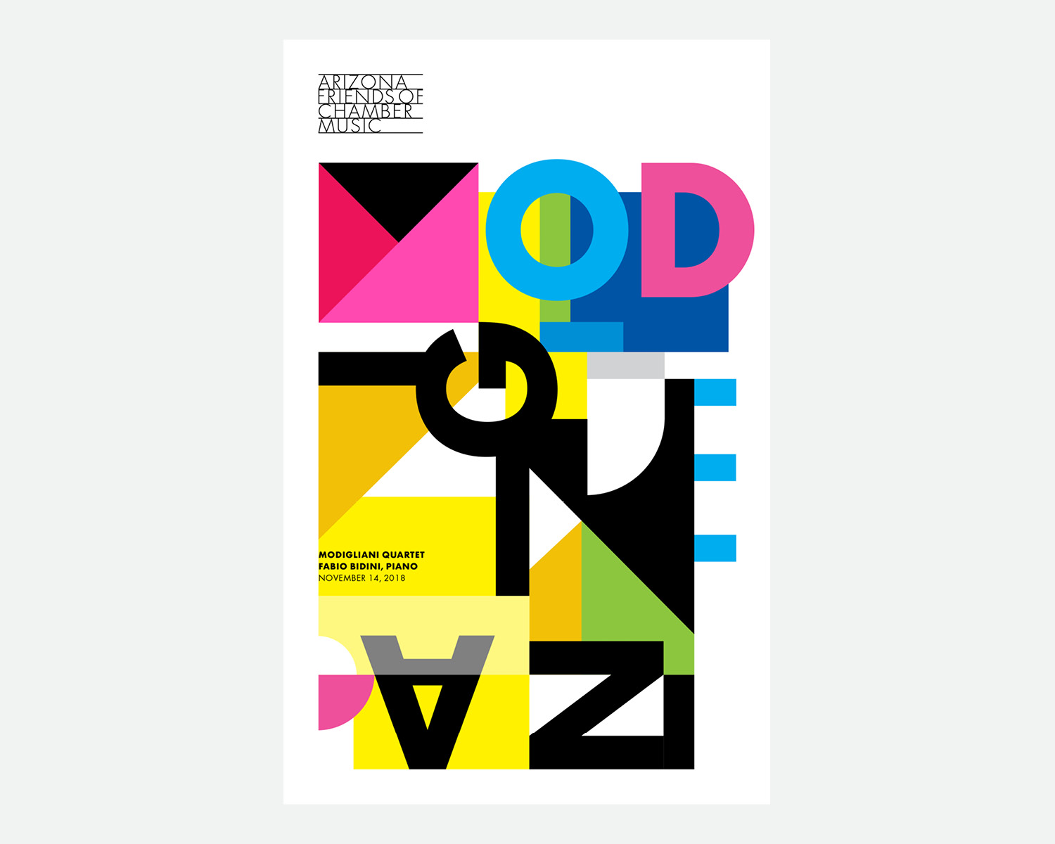
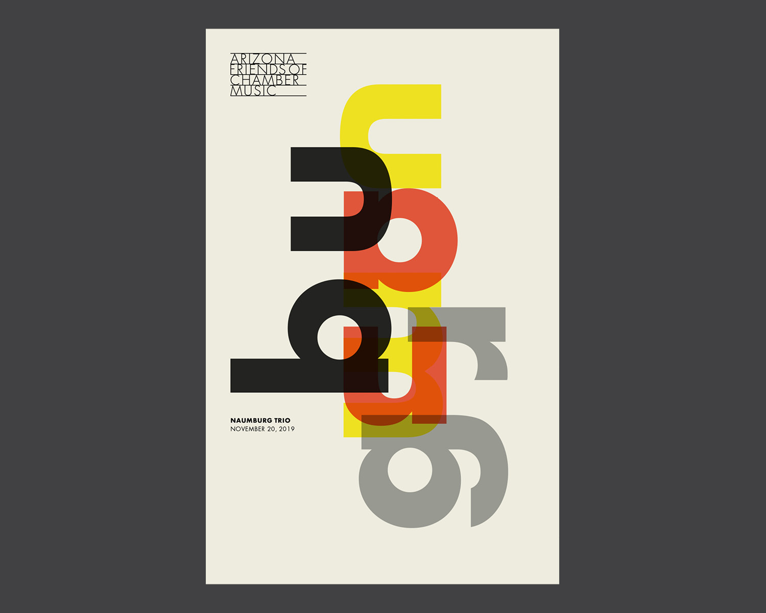
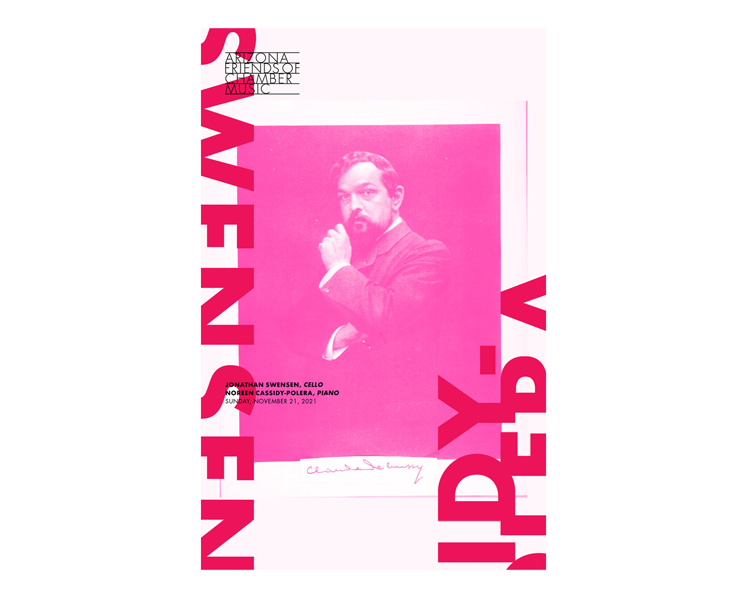
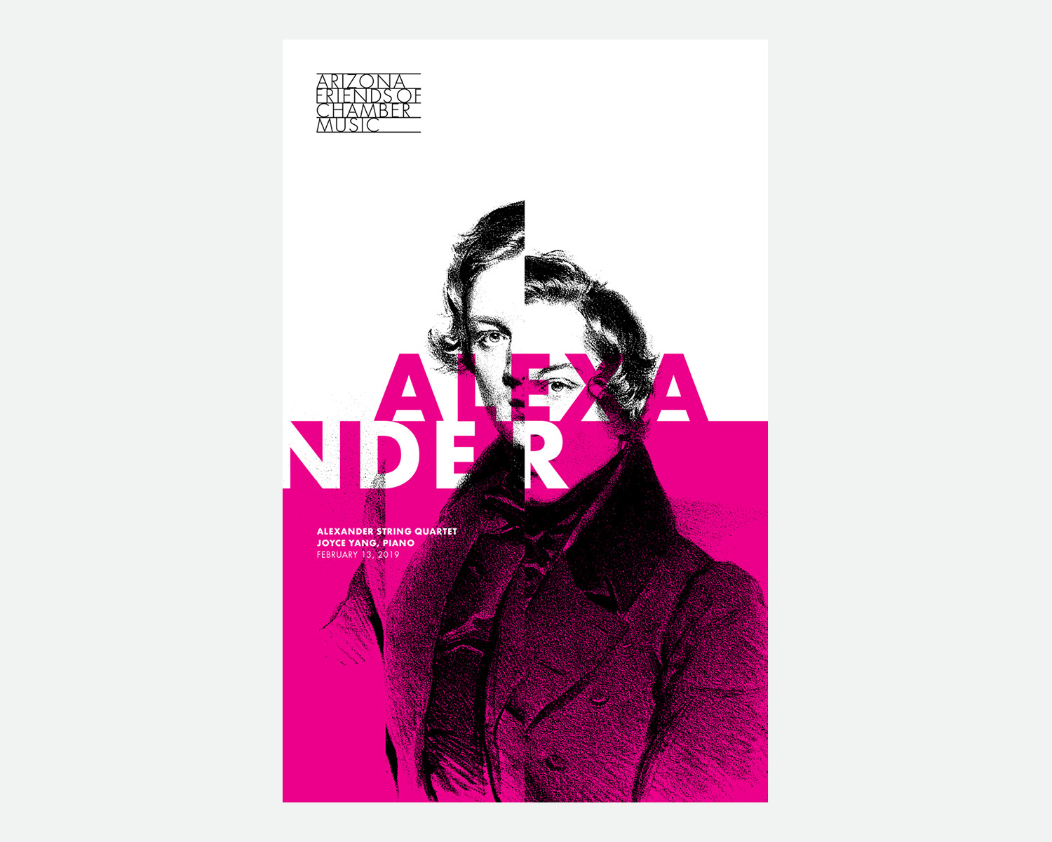
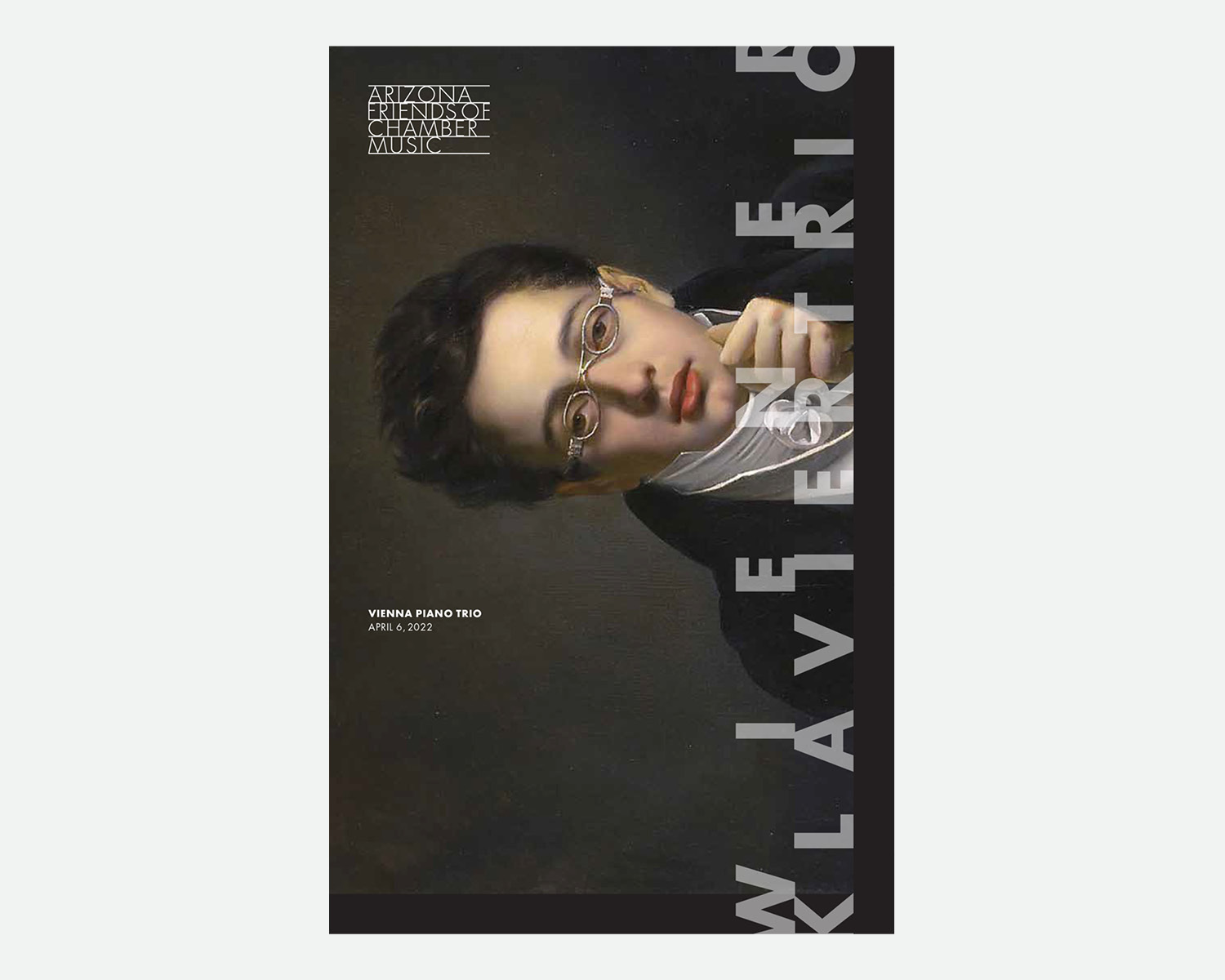
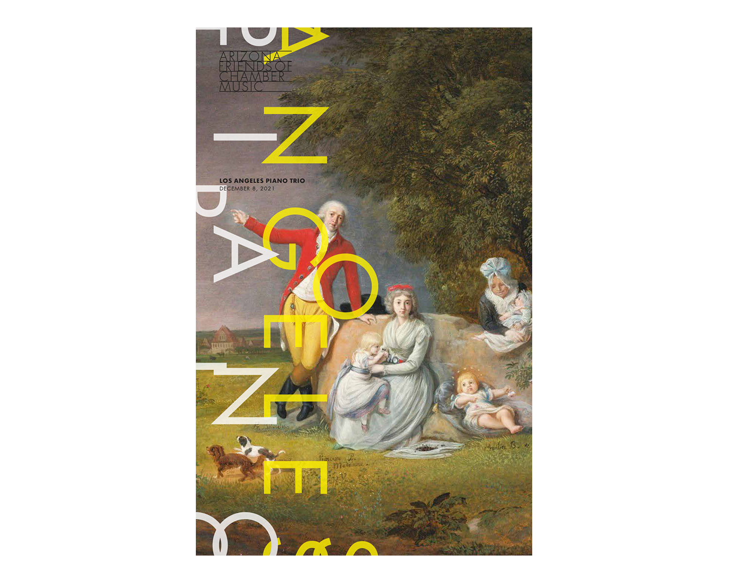
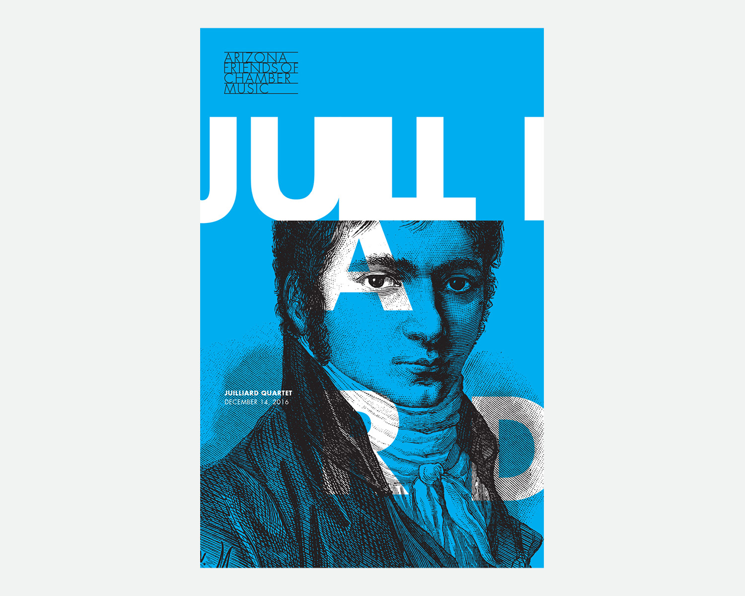
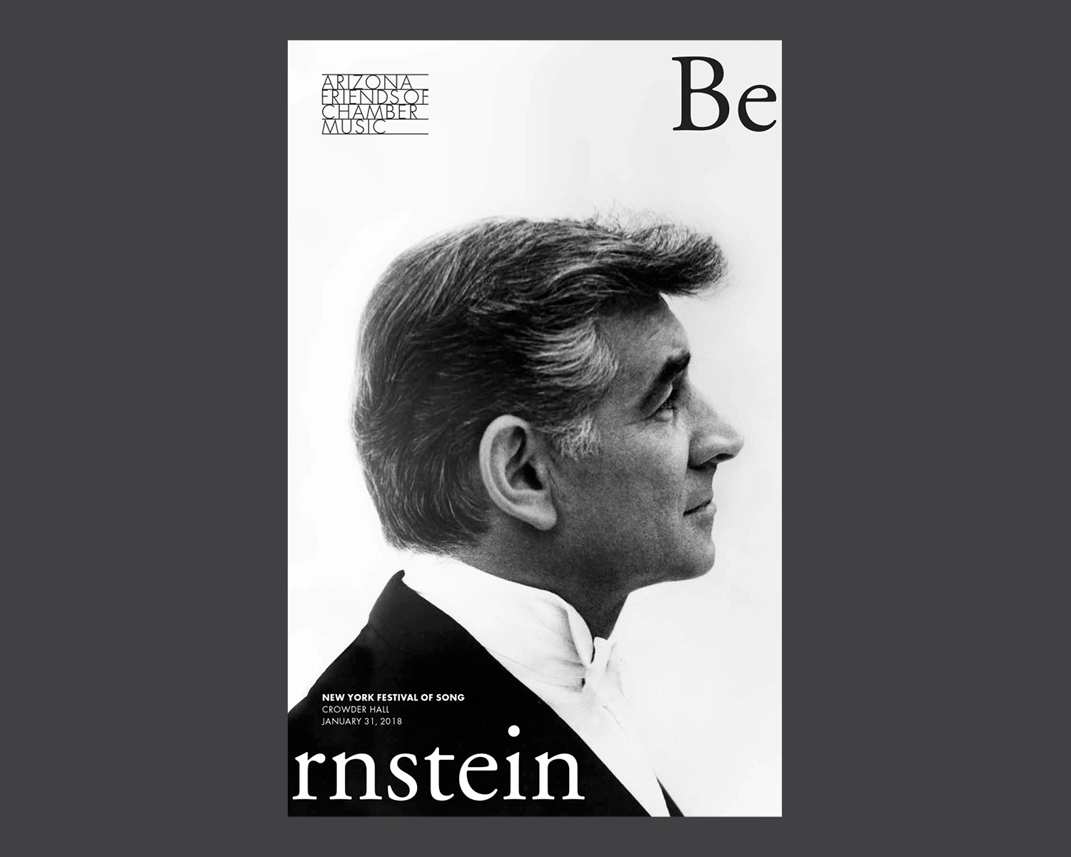
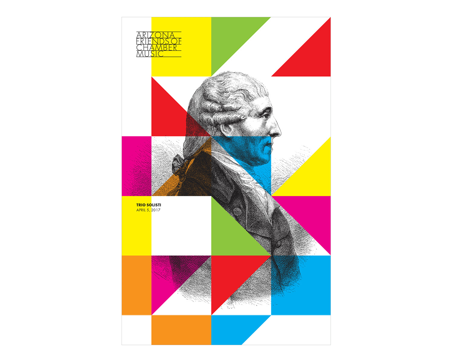
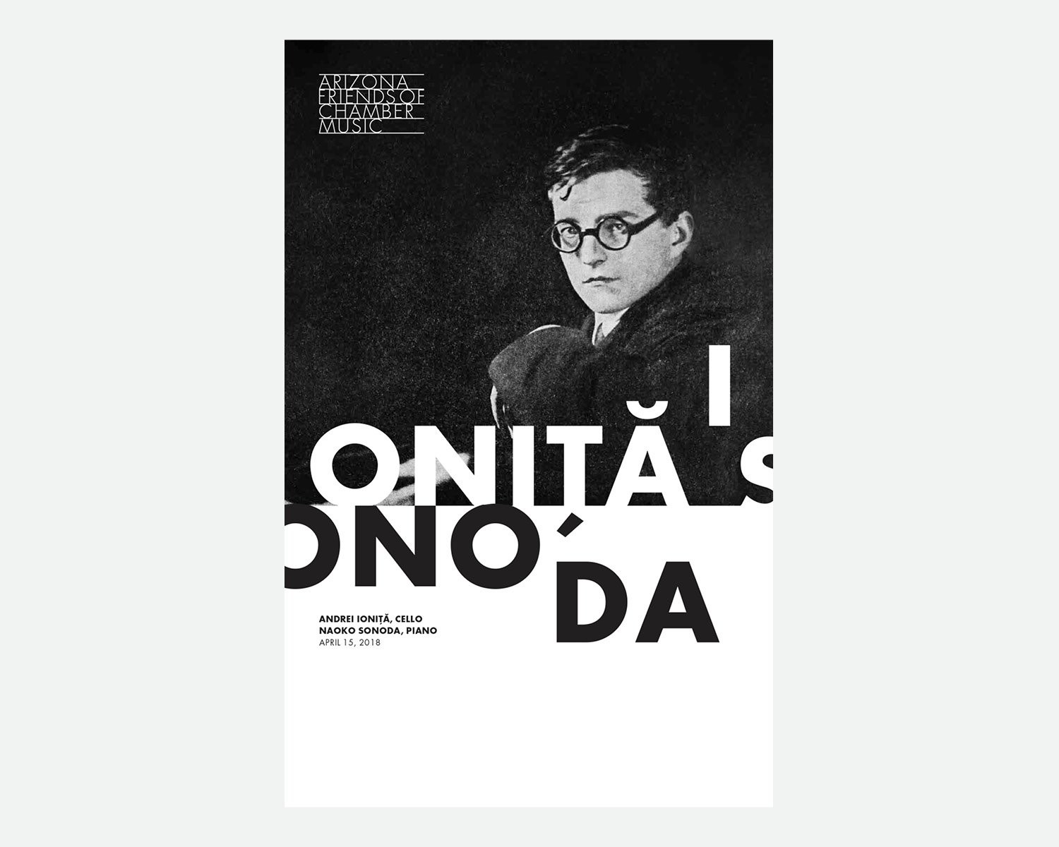
Arizona Friends of Chamber Music


Problem
This 50 year-old non-profit had thrived for years with a DIY approach but had gradually experienced a fall off in sales and attendance putting its survival at risk. Given the excellence of the product, Arizona Friends of Chamber Music (AFCM) ought to be have been thriving. Without the tools for the modern world though, it was clear it would continue to lose its donors and ticket buyers.
This 50 year-old non-profit had thrived for years with a DIY approach but had gradually experienced a fall off in sales and attendance putting its survival at risk. Given the excellence of the product, Arizona Friends of Chamber Music (AFCM) ought to be have been thriving. Without the tools for the modern world though, it was clear it would continue to lose its donors and ticket buyers.
Outcome
It was clear that a comprehensive marketing strategy and rebranding was needed to strengthen audience loyalty, attract new concertgoers, and turn around the decline in sales. We achieved this by clarifying the organization’s identity and implementing consistent design and messaging. A vibrant new visual identity revived existing patrons’ interest in this centuries-old artform, and caught the eye of new, younger ticket buyers.
It was clear that a comprehensive marketing strategy and rebranding was needed to strengthen audience loyalty, attract new concertgoers, and turn around the decline in sales. We achieved this by clarifying the organization’s identity and implementing consistent design and messaging. A vibrant new visual identity revived existing patrons’ interest in this centuries-old artform, and caught the eye of new, younger ticket buyers.
We redesigned the website to improve functionality and developed it as a tool for promotion, archival record keeping, donations and ticket purchases. We wrote a marketing plan, which identified the growth opportunities, clarified the market positioning, and laid out a road map for the future. As a result, AFCM has attracted a more diverse audience, brought back lapsed donors, increased ticket sales, and significantly increased fundraising.